Wednesday, November 23, 2011

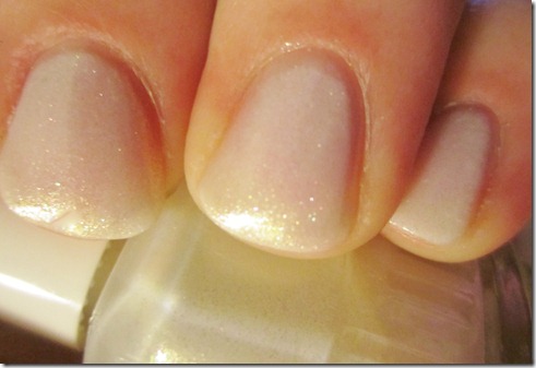
Duri Icicles


Duri Icicles

This is part of the new Duri Girl with the Dragon Tattoo collection (for which I am currently working on the review).  I was going to wait to post this one until I am finished with the post, but I have had it on my nails for 2 days now, I love it to pieces, and I just had to share it with you.  I will give a more detailed review when I review the collection.

Hope everyone has a great Thanksgiving.  Smile

Monday, November 21, 2011

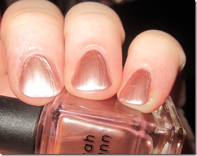
Deborah Lippmann Glamorous Life

Every so often, I get a wild hair and decide to order a Lippmann polish.  As I’ve been out of the loop for awhile, I really wasn’t sure what was out there in terms of new Lippmanns.  As it’s almost Christmas, I expected total glitterbombs (which there are) and some awesome-looking cremes (which there are).  So, I completely shocked myself when the one I chose to order was Glamorous Life.

It looked interesting in bottle pics and the few swatches I’d seen of it looked really nice.  Aaaaand, as soon as I read that Deborah Lippmann described this as the perfect rose gold, I knew I had to get it.  I’m a complete sucker for any thing rose gold.

The only thing that made me nervous was the finish.  It looked brush-strokey.  However, I didn’t even give it much though.  I loved the idea of it that much.

Well, it came yesterday…

Lippmann Glamous Life

Truth be told, I’m a little torn.  On one hand, Deborah was right… this is an amazing rose gold.  Unfortunately, OTOH, it’s not the satin finish I was expected based on it in the bottle.  It seemed very frosty to me.  On the first coat, in fact, I was ready to immediate add it to my “donate” pile. 

But, I gave it 2 more coats, and I must say that while I’m not in love with the finish, or the fact that I had so many issues with drag and strokes, I think the color of this is perfect.  It almost reminds me of a pink/gold version of Lippmann Purple Rain (which was another beautiful color with a nightmare application/finish).

That said, I just don’t know if the beautiful color is enough to offset all of the negatives or not-positives on this one.  I think I’m going to try it as a full manicure and definitely use a sticky base coat, as I feel that would really help with the brush-strokes.  It would also allow me to use 2 coats, rather than 3.

All-in-all, if you are a sucker for rose gold that’s not a foil or a bright metallic, then the color on this one may tempt you.  Just know that it’s frosty.  And while, it doesn’t give me old-lady-hands, but it does show strokes and drag.

Lippmann polishes are available through Deborah Lippmann’s website (www.deborahlippmann.com).  I usually get mine from What She Buys.  They ship super fast and change nothing for shipping. 

Lippmanns can retail up-to $20, though this polish like most other non-glitters is $16.


This polish was purchased by me.

Thanksgiving Skittles


Hi everyone, it’s so hard to believe that Thanksgiving is a matter of days away.  I swear, the older I get, the shorter the years become and this time around, it feels like we should be somewhere in May. 

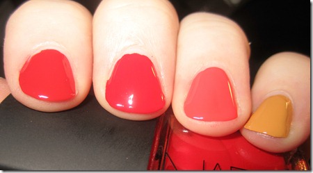
As I was sitting here contemplating the upcoming holiday, I suddenly had the idea to create a Thanksgiving-inspired skittles.  My desire was to do more of an “ombre” effect, but it wasn’t quite there. 

Thanksgiving skittles

This is L-R, Zoya Tamsen, NARS Dovima, OPI A Good Man-Darin is Hard to Find, and Barielle Angora Aura.

I swear, it looked better on.  Smile with tongue out  My flashed washed out the oranges, and yet when I managed to get one that was true to color, it made my skin look odd.  Oh well.  I still think it was a cool concept.  While I was doing it, it really reminded me of the colors of the fall leaves, though at this stage, they are almost all gone. 

Anyway, just in case, I don’t post, I hope you all have an amazing Thanksgiving to my US readers, and to my international folks, I hope you have a great Thursday. 

I do plan on posting soon, however, as I do have Duri’s new Girl with the Dragon Tattoo collection begging me to swatch them.  I also have to play catch-up with holiday collections from OPI and Zoya.

Friday, November 11, 2011

Curtsy & Bow

A couple of months ago, I was asked by Curtsy & Bow's PR to review their products. Given my love of new brands, I was all over it.

I received 2 colors from their debut collection, "The Yacht Club" collection. The inspiration behind this collection was the creator's, Melissa Huynh's, travels throughout the caribbean.

Here's a list of all of the colors in the collection:
Intimate Sand is a powder pink solid lacquer
Shell We Dance is a peach/coral pink solid lacquer
Wasap-bi? is a Khaki/Green Solid lacquer
St. Thomas Blue me Away is a powder blue solid lacquer
Shiraz with tha Stahz is a deep wine with silver speckles lacquer
Supernova Girl is a silver glitter top coat
Jetset In My SunSet is a gold glitter top coat

I received Intimate Sand and Shell We Dance...


Intimate Sand - soft pink. This one is a pale pink, but it's not sheer. The color was extremely pigmented. I always find that I love the color of pale pinks, especially in early spring, but I hate the fact that it takes a gazillion coats to reach opacity. And if you do get one that is opaque in just a few coats, it looks chalky. This one only took 2 coats to reach opacity and isn't chalky.


Shell We Dance - creamsicle orange. I know Curtsy & Bow describes this as coral/pink, but on me, it definitely looked like the color of orange push pops. It's a pretty color, but with my pink skin, it seemed a little off. I think this would look fantastic on someone with darker skin.  Two coats.

I liked these colors. I felt that the formula was a bit thick and I thought the brush was a bit hard to handle, but I got the hang of it after a few tries (the handle is very short).   I really liked that they were opaque in just a few coats.  My favorite was definitely Intimate Sand.

These retail for $15 (I think) and for more information, you can view their blog.

These were sent to me for review

Hi again :)

Hi girls (and boys).  Hope everyone is well.  I can't believe it's been 2.5 months since I've blogged.  When I started this blog almost 3 years ago, I swore to myself that I would never be one of those bloggers that allowed their blog to fall by the wayside.  Unfortunately, this year has been incredibly rough for me, both of our older dogs passed away, my son was diagnosed with autism, and my grandmother died on Labor Day.  I also got a new job which is eating up all of my free time.  So it just happened.  For those of you that have stuck with me, I greatly appreciate it. 

I am desperately trying to get back in to blogging, not only because I enjoy it greatly, but because I do feel a responsibility not only to my followers and readers, but also to the polish companies that ask me to review their products.  I am currently working on posts.  However, I have such a backlog, that you may see posts from collections that have been out for awhile.  I am going to try and get to the holiday collections first, though. 

Thank you so much for reading,
Megan

Wednesday, August 24, 2011

OPI Pirates of the Caribbean: On Stranger Tides Review

As I am continuing in my tradition of striking while the iron is hot (LOL)... I bring you the months-old OPI Pirates of the Caribbean collection.  Unfortunately, this one that got put aside while I had to take a little break and I'm just now able to review it.  However, as the movie is due to be released on DVD in November, I figure I'm still relevant.  Heck.  I'm now ahead of the curve.  :P

Anyway, this was OPI's "Brights" offering for 2011, and that kind of threw me, as their brights collections in the past have been extremely vibrant, and bright hues.  These colors, as a whole, are far more subdued that past collections.  However, I actually think it's a misnomer to call them pastels.  While the are lighter shades, there is still a vibrancy about them that I would not associate with a pastel shade (as when I think of pastel, I think of soft baby-ish colors).


Mermaid's Tears - Mint green creme.  This one has perhaps a bit more blue in it and is perhaps a tad brighter than a traditional mint.  However, it still gave me a dreadful (say that in a pirate voice) case of red-hands.  The color is absolutely beautiful, but I just can't wear it.  :(


Planks A Lot - Slightly dusty, mid-tone purple.  This one is probably on the lighter end of what I consider mid-tone.  However, it's much darker and brighter than what I consider to be a light purple or a lavender.  There is a slight dustiness to it, but I don't think it's a dupe for RBL Purple Haze (though if any one wants a comp, I will be glad to do one).  


Skulls and Glossbones - Pale grey creme.  Yes, this one is a pale grey, but going back to the vibrancy I mentioned above, it's not a color that looks white.  It is most definitely grey.  It's also got enough warmth in the base to not give me dead-hands, but it's not exactly what I would consider to be a warm grey.  It also has a touch of green in there to give it just a slight dirtiness (along the lines of Stranger Tides, but not nearly as funky).


Sparrow Me the Drama - Tea rose creme.  When I was swatching this, I thought it may be a dupe to RBL Smitten, but after looking at pics, I don't think it is.  Sparrow Me the Drama has a smidge of purple in it, whereas Smitten is a true rose creme.  That said, it a gorgeous color, and it looks amazing under Lippmann Glitter in the Air


Steady as She Rose - Pale dirty rose creme.  Again, like most of the other colors in this collection, Steady as She Rose has a slight dirtiness to it.  These colors really do fit in well with the Pirates of the Caribbean theme.  It is a pale pink, so you wouldn't think it would be that unique, but the dirtiness really sets it apart. 

Stranger Tides - dirty, artichoke green.  This color is completely funky and it didn't work with my skintone.  That said, I completely loved it. 

Also, the formula on these was fantastic.  I had no application issues with any of the colors and each color was opaque in just 2 coats. 

I kind of wish that they had included a bright Caribbean blue with this collection (perhaps lose one of the pinks), but I think being a collection based on a movie, it was cohesive and well-thought-out.

Additionally, along with these 6 cremes, OPI released Silver Shatter along with this collection...


Here it is swatched over Stranger Tides with no TC. 

The fact is, I stink at crackles/shatters.  I hate that you have one chance at getting it right.  You also have to have just the right amount on your brush and go in the right direction.  It's just too much pressure.  LOL.  I have problems with getting the right amount on the brush, so I either end up with a thin coat with drag marks or a thick coat that never cracks.  That said, the finish on this one is gorgeous and if you and crackle work well together, I think this would be an amazing option to add to your collection.

This collection is out now and OPI retails for $8.50 a bottle.

these were sent to me for review
Monday, August 22, 2011

Julep Charlotte Revisited

So late last week, I happened to "like" Julep's Facebook page and discovered that they had linked my recent review post of their products.  At first, I thought it was so cool.  Then... I realized that almost all of the comments were blasting me.  :( They thought my application was sloppy, my pictures were bad, and generally, my post was crap.

My immediate reaction was to get extremely upset and vow to cease blogging (I may have even teared up).  I mean, no one likes being the center of negative attention.  I honestly think that most non-bloggers don't realize how much work goes in to a post.  It seems that the entire nail blogging culture (and maybe the blogger-verse in general) is completely different that it was when I first started.  I am not a professional.  Everything I do is through a process of trial and error.  With each post, you learn what doesn't work and what does work.  You try to improve with each week and sometimes it work and sometimes it doesn't, but as a blogger, I am always trying to get better.  Trust me, go back and view some of my older posts.  Those were crap.  LOL. 

Then I got pissed.  :P

So, after licking my wounds and emotionally cutting by reading the replies over and over, I decided that for my own sense of pride, I would re-swatch Charlotte.  I thought the color was awesome, but most of the replies centered about just how bad my swatches were of that particular color.  So, I dug out my old camera (seriously, this Canon and I are not getting along) and took some new pics. 

This is 2 coats of Julep Charlotte.  I used my older Sony DSC-W310 with a filtered flash under a desk lamp.  I also cut down my nails as I just don't think longer nails and I get along. 

If you had an issue with my previous photos, I really hope this shows Charlotte in a different light.  It's a beautiful color. 

Also, I wanted to ask that if you are a nail blog reader, please realize before you trash someone elses' pictures, that attached to those hands is a person.  Yes, it's a person that is taking pictures of her (his) hands and putting them on the internet, but it is still a person.  The internet gives us so much anonymity that we oftentimes forget that we aren't just faceless, emotionless automatons.  This is one of my main issues with the nail blogging community at the moment.  With the rare exception, we are all doing this as a hobby, so please be mindful of that.  Yes, as a fellow blogger or reader, you are entitled to your opinions, but in the immortal words of my mama... "a little decorum never hurt anyone".  :)

Tuesday, August 16, 2011

Julep Maven - Box 1

So last week, right after I showed you my review for Julep polishes, I caved and joined the Julep Maven program.  I thought it was a great deal at $19.99, and also, as nail mail is one of my guilty pleasures, I figured it was a good way to get a box of nail goodies every month.

I received my first box today, and I am very happy with it.  Here's what I found when I opened the box (it was all in a gift bag, btw)...


And here are the 2 colors I received...


Samantha - bright pink.  This one is amazing.  It has a jelly-ish finish, but it was opaque in 2 coats.  

Zoe - bright copper.  Seriously.  This is like the color of new pennies.  This is one of their not-yet-released fall colors.  3 coats.  

This is the "Bombshell" box.  Honestly, I had to do a little manipulation to get this box.  I took the "style quiz" at least twice, and it each time it came back as "All American Beauty".  Well, while that may fit my fashion sense, it's not exactly what I prefer on my nails.  So, I chose the strappy shoes instead of the platforms, Chanel as my designer, rather than J.Crew, and picked Colin Farrell over George Clooney (what?) and voila... I'm a Bombshell.

Also, keep in mind that Julep has a few coupon codes for the Maven program floating around.  I think there is one on Facebook, and also, when I took the quiz, I got a code in my email box to for 1/2 off my first month.  Unfortunately, I had already joined by that point, and I'm still trying to see if I can get that retroactively applied.  So be sure to check for those codes before joining.  

Even with paying full price, I still think this is a great deal.  I know Julep polishes get a bit of a bad rap for being such a small amount (.27 oz, compared to .5 for OPI), but as I have NEVER used a full bottle of polish, I think I'm good.  LOL.  Plus, there are other goodies, and 20% off all other items that you order (I am eyeing Stella) and free shipping (which when I get free shipping, I feel like I've won the lottery, so that's awesome!).

And, if you refer your friends to Julep, you will get $15 when they become a Maven as well.  You can join the Julep Maven program on their website, or by clicking here.

I paid for my own membership to the Maven program.  However, the links within this post are affiliate links.  I will receive $15 when you join by using my link.  When you join, you will get your own link.


Friday, August 12, 2011

Rescue Beauty Lounge Look Rich, Be Cheap

Due to some recent nail growth, I am trying to keep my nails polished, which means that I am polishing my nails everyday (I have the attention span of a gnat).  I've been mainly sticking to new releases, as that's what I've had on my desk, but tonight, I brought this one out of the depths of my storage container, and oh how happy it's made me.

RBL's Look Rich, Be Cheap was from the 2009 Spring glitter bomb collection, which in my mind was the catalyst for all the full-coverage glitters we've seen over the past 2 years.  I remember when I first saw swatches of this glitter and her sisters, Locavore and Frugalista.  I fell instantly in love, but still being a newb and balking at an $18 polish, I resisted until the half off sale in the fall of 2009, where I picked them up.  And my love for them has not waned, considering that the glitters and a couple of other colors were the only things I kept when I decided to part ways with my RBL collection (the formula just doesn't play nice with me).   Unfortunately, I just haven't worn them as much as I should have.  Well, lemme tell ya... that's gotta stop.  :P

This one is absolutely amazing.  It's varying shades of gold glitter with pops of bright, purple glitter, and as yellow and purple are opposites on the color wheel, the color combo is gorgeous.  The base is clear, and though it looks like there are bald/thin spots in my swatch, the coverage on the nail is actually quite good.  Any thin spots that are on there, don't show up to the naked eye.

This is 3 coats of Look Rich Be Cheap over a coat of CND Stickey.  I also had to apply 3 (!) coats of TC as it still seemed really textured at just 1, or even 2, coats.  Honestly, even with the 3 coats of TC, it's still not smooth, but that's pretty much par for the course with a dense glitter.

Also, I realize I have reviewed Look Rich, Be Cheap already in the past, but as that way back when my nails were recovering nubs and my camera was crap (and perhaps a lot of user error), I figured I'd give this one another showing. 

Look Rich, Be Cheap is the only glitter bomb still remaining in stock on RBL's website (though I think Locavore is coming back).  Price is $18.

this was purchased by me during RBL's half-off sale

Thursday, August 11, 2011

Lex Cosmetics Seashell


You may remember that around the first of the year, Ji offered a RBL fan submission contest.  My entry was for an "oilslick" polish.  Unfortunately, it wasn't selected (it may have been put in her "impossible" catagory. LOL), so I was more than a little excited with Sarah's Seashell/Oilslick inspiration polish was voted to be in Lex's line up of polishes.

I finally got around to getting this one last week, and while it's a very pretty polish, I have to say, that I'm a tad underwhelmed.  :(  This is a deep charcoal base with tons of subtly holo microshimmer.  Again, it's pretty, but it doesn't quite meet what I had in mind.  I expected it to be a duo/multi-chrome rather than a holo, and the black base really took me out of the "inspired by a seashell" backstory.  It's silly, but in my mind, there is a bit of a disconnect between a deep charcoal polish and a seashell (of course, I fully admit that is probably nitpicking).

Also, when you have a polish like this, it comes with the territory that it's going to be compared to OPI My Private Jet holo.  And when you do that comparison, there is no contest.  My Private Jet will always reign supreme (of course, it's now super rare and $$$, so perhaps this would be a good lemming slayer)  However, Seashell seems very similar to Color Club Revvvolution (which I blog-sold or I would compare) and perhaps Diamond Cosmetics Chainmail Charm (which I never owned).

In terms of application, my bottle leaked quite a bit in transit and I think that made the formula a bit thick.  It wasn't impossible to work with by any means, but I just had to be careful with it.  It was a good formula, though, and it dried fast and is super, super glossy with just 1 coat of TC (which is awesome considering sometimes, these kinds of colors have a tendency to eat up TC and end up looking muddy).  I haven't been able to stop looking at my nails today because the finish is so SHINY!  :)

Even with my issue regarding the color and leakage, I still wouldn't dissuade you from picking this one up, especially if you don't have any of the similar colors, and one of the reasons I'm saying this is because of the company, Lex Cosmetics.  First off, this is the only company, that I can think of, that let's their customers decide on their entire color line, not just a couple here and there.  Also, $1 of each bottle sold goes to the charity of the creator's choice.  In this case, Sarah's requested that $1 go to the fight against sexual assault.

Seashell is available at www.lexcosmetics.com, and the cost is $10 per bottle.

this was purchased by me

Tuesday, August 9, 2011

OPI Stranger Tides


I shouldn't love this one as much as I do. It gives me red-hands, and it's not a particular pretty color, but that doesn't stop me from being madly in love with it.  I can't really tell you why.  It's an odd, slightly dirty, artichokey green creme.  However, the formula is fantastic and the application was flawless.  Plus, I like that the color is a bit of an odd duck.  It's not typically "me", but I do like it.  LOTS.

Stranger Tides is from OPI's Pirates of the Caribbean collection that was released earlier this year.  This has been out for several months and OPI's polishes retail for around $8.50.

This was sent to me for review

Julep Polishes

You wouldn't think so, as I am someone that has an undisclosed amount of polishes (read TONS), but more times that not, I have a tendency to get in a rut and find myself only using certain brands.  As such, I absolutely love when I discover a new-to-me brand.  One of these brands, Julep, I recently had the opportunity to try.

UPDATE... Here's a better picture of Charlotte:


Charlotte - Dusty, plummy purple creme.  This color is absolutely beautiful.  It's a dusty purple creme, with enough red in the base, to not be a dead-on dupe for RBL Purple Haze.  That said, as RBL Purple Haze is currently discontinued (though I think it is coming back for a limited edition redux), Charlotte may just fufill and "dusty, mid-tone purple" lemmings you may have.  And since I know you are asking, here's a comparison...


Charlotte is on middle and pinky, Purple Haze is on ring finger.

As much as I love Purple Haze, and I do love it as it's one of the few RBLs I've actually kept, I think I may love Charlotte more.  First off, the formula on Charlotte was EXCEPTIONAL.  Both swatches of Charlotte above are one coat.  ONE.  That's it.  Y'all know how I love my one-coaters.  :P  Purple Haze is a 2-coater for me.  Also, the color just seemed to work so much better on my skin-tone.  If you have super pale pink hands like me, then you may find that mid-toned purples have a tendency to give you dead-hands.  Because of the plummy/red base in this, I didn't get that with Charlotte.


Emmanuelle - Pale, soft baby pink creme.  While I call this one a creme in my descriptor, it actually seemed more like a jelly to me, or at least jelly-esque.  It really reminded me of the soft shades from OPI Femme de Cirque.  However, this formula, again, was so much easier to work with.  I had zero drag with Emmanuelle, and I didn't even have to wait between coats (something I normally have to do with paler shades).  It's a super pale pink, so of course, it's a little on the sheerer side, but it is buildable.  The above picture is 3 coats, and I was able to reach opacity.  However, I bet if you used a sticky base coat, you may actually be able to reach opacity with 2 coats.


Natasha - Bright red-orange creme.  Ahhhh.  Natasha.  I swear, I have been craving this exact shade of red/orange, so when I opened my box from Julep and saw this little beauty in there... I admit it... I squealed.  This one, like Emmanuelle, did have a bit of a jelly quality to the finish.  It almost looks like hard candies.  I was able to reach opacity in 2 coats, however, so it's not a true jelly.  And, I know I sound like broken record, but again, the formula on this one was great. 

All in all, I really like all 3 Julep polishes that I had the opportunity to try.  As it was a brand I was unfamiliar with, during my review, I happened to check out their website, and I was happy to see they had around 70 colors (I'm currently eyeing Stella).  They also have something called "Julep Maven" which is a monthly shipment program.  For $19.99, each month, you get $40 worth of nail polish and treatments (and extra goodies like free shipping).  I haven't joined it yet, but I must say... I am EXTREMELY tempted.  Also, $1 of each bottle purchased goes to Julep's "Powered by Girlfriends" program.  Plus, and this is a HUGE plus, the formula on all of these was fantastic.  It makes me tempted to try more.  :)

Julep polishes are available for sale on their website (and if you are in the Seattle, WA area, I'm guessing they are for sale in-store).  Price is $14/ bottle.

these were sent to me for review
Monday, August 8, 2011

Nicole by OPI I Love You Cherry Much

When I posted my review of this collection yesterday, I was very unsatisfied with my pictures.  However, as soon as I finished my review, I put I Love You Cherry Much on my nails as a full mani, so I wanted to share that picture, as I feel it's MUCH better.


After I've gotten a chance to wear this color as a full mani, I must say that I really love it.  It's also completely unique.  Yes, it's a glass fleck shimmer (a la China Glaze Summer Days) and yes, it also has a metallic element (like the shimmers from OPI Burlesque), but the finish on this is what truly sets it apart.  It was hard to capture with the camera, but this one dries to an almost-satin finish.  That allows the shimmer to become "trapped" (like it is when you put a matte top coat over a shimmer or a glitter), and gives the shimmer much more depth.  Again, that's one of those things that just couldn't be captured with a digicam.  If you like bright, pink-based reds, I would totall give this one a look-see, as it is gorgeous!  Also, in my swatch yesterday, I used 3 coats, and in my full mani, I only used 2.  I do have a bit more VNLs in this one, but they aren't that noticeable. 

Like I mentioned yesterday, these are available at Target now (or at least they are at mine).  And, like most of the other Target-exclusive NOPIs, I am assuming this will also be available at Target.com (though I don't see it now).  Retail is $7.04. 

Sunday, August 7, 2011

Nicole By OPI Something About Color Target Exclusive collection Review (Fall Colors)

Back in March, I showed you the Nicole by OPI Spring Target exclusives.  Well, they have come out with 4 additions to this collection for Fall 2011. 

FYI, I got a new camera, a Canon SD1400IS, and I am still trying to work out some growing pains, so I'm sorry if these pictures are sub-par.


Cherry Much In Love - bright cherry red, glass flecked shimmer.  This one is beautiful.  The base was a little jelly-ish, so the glass flecks kind of suspended in the base.  I had no issues with application and the formula, was great, though a little thin.  Three coats


Green Up Your Act - dusty, greyed olive creme.  I struggled with this one.  I swear, I swatched it twice and took a gazillion pictures and I still wasn't satisfied.  The color is definitely unique.  It's not a traditional camo green, or an olive green for that matter, it seemed to have a lot of blue/grey in the base.  It also had a dustiness to it.  I struggled with the formula, as it seemed a bit goopy to me.  Picture is 3 coats, and I had an issue with drag, so it looks lumpy in places.


It's Not Me, It's Blue - Grey/blue metallic shimmer base with purple microshimmer.  This one is amazing.  I saw it at my local Target, and I immediately fell in love.  I promply came home and put it on my nails.  It's very similar to Sounds Grape to Me, it terms of formula and finish, and it feels almost like a foil.  It also has a beautiful purple shimmer that will pop when you turn your hand (there is also some golden shimmer, as well).  The formula was thin, so I did have to use 3 coats, but they dried quickly, so no issues.  Also, this picture was taken with my old camera, so that's why it seems a bit different.


Sounds Grape to Me - Deep purple/burgundy shimmer base with golden shimmer particles.  This one was very reminiscent of OPI Tease-y Does It or Zoya Valerie, but unlike Tease-y Does It, this one didn't seem muddy.  I think this one is my favorite of the 4.  The color is practically mesmerizing.  Formula was good and it reached opacity at 2 coats.

All in all, I like this little addition to Nicole by OPI's Target collection.  Green Up Your Act does seem to be the odd duck, but those of you that like dusty, ugly-pretty colors, will love it.  Also, and this may just be because my were press samples, but only Green Up Your Act had Nicole's new brush, and that's perfectly fine with me.  However, if you are a fan of their new brush, be sure to check your bottles at Target to see if they have them.

These are at Target now and retail for around $7 each.

these were sent to me for review

Wednesday, July 27, 2011

Cult Nails My Kind of Cool Aid

This is one of those polishes that I purchased earlier this year and just never got around to posting it.  My Kind of Cool Aid was Cult Nails' very first color.  I ordered it as soon as Maria said it was for sale on her website and then I got it and it quickly got lost in my collection.

Then yesterday, Maria tweeted that Cult Nails had given 600 bottles of My Kind of Cool Aid to the HollyRod Foundation in support of their Design Care 2011 event.  As a mom of an autistic child, I thought, "that's awesome!" and then, I thought "I have that".  So, today, I dug it out of my (still) disorganized polishes.


And now I'm kinda sad that I left it unworn so long.  LOL.

My Kind of Cool Aid is a "greige" shimmer, but it also leans a bit lavender.  Kind of like Wild Orchid from Color Club's fall 2010 collection, though they aren't dupes.  The shimmer in this one is micro-shimmer in shades of pale blue and pink, but you have to look close.  When I first looked it it, the shimmer just looked silver.  The formula was good.  I did have a bit of an issue with drag, but that's easily solved by waiting a couple minutes between coats.  Pic is 3 coats, though it you are careful you could probably get away with 2.

This makes me really want to try more Cult Nails polishes, and I'm still kicking myself for not picking up Captivated before it sold out.  :(  :P
l
Cult Nails polishes are available on their website.  They are $10.  Also, I noticed that during the month of August, Cult Nails will donate a portion of its sales to the HollyRod Foundation.

this polish was purchased by me

Thursday, July 21, 2011

OPI Serena Williams Glam Slam pt. 3 Review

This is the 3rd installment of OPI's collaboration with Serena Williams.  As this one was meant to coincide with Wimbledon, the names are subtly English.  Also, this is the first set in the Serena Williams collection that isn't a sparkley base color with a shatter top coat, and as someone that still has issues with correctly applying crackles/shatters, I must say that this was a welcome change.  These sets consist of a base color and the same glitter top coat.

Grape...Set...Match - grape purple shimmer base with pink, blue, and turquoise shimmer particles.  Sigh.  I loved this one.  It is an amazing color and the entire time I was swatching this one, I kept thinking that it is a marriage of OPI Ink and Lourve Me Lourve Me Not.  It's got qualities of both.  However, unlike Ink, the shimmer doesn't get lost and unlink LMLMN, it doesn't look muddy.  So, in my mind, it's the perfect combo of the two.  The application on this one was fine, though it was still thin in spots after 2 coats, so it was a 3-coater for me.  


Servin' Up Sparkle (over GSM) - Small round and large hex HOLO glitter in a clear base.  Okay, now this is amazing.  I'm in love with this topcoat.  In fact, as soon as I received this from OPI, I slapped it on my nails.  This looks beautiful over every color I've tried, but really shines when placed over a shimmery base.  This is one coat over GSM.

Your Royal ShineNess - Silver foil metallic.  This one is pretty straightforward.  It's a little more muted than a bright silver, though.  It's reminiscent of Orly's Shine FX colors from last year.  The application was perfect.  2 coats.
Servin' Up Sparkle (over YRSN) - believe it or not, the effect of this over the silver was much more subtle than it was over the purple, but it is still crazy pretty. I think I'm in love with this TC.  

All in all, I'm a huge fan of this collection.  Everything about it is fantastic.  I'm a fan of the Serena Williams collection, in general, but this is my favorite one.  LOVE.

These were sent to me for review

OPI Nice Stems Review

Again, I'm trying to play catch-up with all the collections I received during my unplanned hiatus.  Nice Stems is OPI's summer 2011 collection.  I loved it from my first glance at the PR pics.  I mean... come on... a collection of all pink.  I may think pink to be a commonplace when it comes to nail polish, but it's still my favorite color.  Hence, OPI had me at hello.  :P

Be a Dahlia, Won't You? - bright fuchsia shimmer.  In the bottle, this one reminded me of Ali's Big Break.  However, it didn't have the metallic sheen.  Nonetheless, this is a beautiful color.  It also has a subtle blue flash (as you can see in my picture).  Formula was great.  2 coats.

Come to Poppy - Coral pearl.  This one is a hard one to describe.  It's not peach, it's not pink, and while I think it's a coral, it also reminds me of those salmon pink crayons from the Crayola box.  Honestly, when I put this one on, I thought I was going to hate it.  In fact, after I put it on, I hated it.  Then I took the pictures and I have to say that I really like it.  It quickly grew on me.  The formula on this one was fantastic.  It glided on the nail.  2 coats.

I Lily Love You (over Be a Dahlia, Won't You?) - Holo flakies in a pink clear base.  I was a little saddened that this one wasn't opaque, as this was the one I was most excited for, based on the PR pics.  Nonetheless, it's a nice top coat, especially over Dahlia.  It reminded me of a pink, more functional, version of CC Covered in Diamonds.  Also, over Dahlia, the gold tones in the flakies really pops.  One coat over the base.


Play the Peonies - pale pink pearl with silver micro-shimmer.  This one is crazy pretty, and I really wasn't expecting much from it.  However the color is beautiful.  It's pink, but it almost looks like a colored white, if that makes sense.  The finish is pearly, not frosty, which doesn't age my hands.  And the micro-shimmer is subtle, but gives depth to the color.  This one really made me wish I had darker skin and pretty feet, as it would look amazing as a summer pedi.  3 coats.

All in all, I really liked it.  Dahlia and Poppy are beautiful, as is Peony.  I think Lily is a bit of a miss, as it's not really usable on it's own, but as a TC for brighter colors, I think it works.  It's a nice collection.  Certainly nothing revolutionary, but it's pretty for summer.

These were send to me for review

Zoya Touch Review Redux

A few days ago, I reviewed Zoya Touch.  Unfortunately, I've been out of this for so long that my pictures were crappy and my review was a little half-assed.  As I was able to find my good camera, I figured I'd re-do my pics and the review, so here goes...

Save for the color, these polishes are identical, so I'm going to post pictures and color descriptions/color reviews first and then post my review of the application and finish.


Minka - warm yellowish tan.  When I first had this one on, I hated in on my hands.  Then, last night when I was swatching it for this redux post, I realized it wasn't so bad.  It almost reminds me of China Glaze Classic Camel, though it's lighter and doesn't have the same shimmer.  Like Classic Camel, it doesn't work with my skintone, but I did like it.  I think this color would look amazing on someone with a darker skintone (actually, all of these colors would probably work MUCH better on darker skin).


Pandora - Pinky Beige.  Again, I find myself really liking Pandora (though, I'm not sure I will wear it regularly... more on that below).  It just works with me.  This is the only one of the 3 that didn't give me red-hands.  


Shay - Silvery beige.  Shay is probably the most neutral of the 3, however, it's the one I liked the least.  The color just wasn't flattering on me.  I thought it made my hands look old.  Like Minka, thought, this one probably would work on a darker skintone or someone with more yellow in their skin.

This collection was a bit of an odd duck, especially for Zoya.  It was nice in concept, but there was something about it that just seemed off to me.  Even though they were similar in a lot of ways, each color was unique in the way that a display full of foundation colors is unique.  They all had subtle variants, but they were all, in essence, beige.  So it really is like foundation for your nails.  Normally, nail polish is more one-size-fits all.  However, these were not.  You would have to really know where you fit in terms of your skintone before you picked up one of these.  

Also, the formula wasn't typically Zoya.  I found it to be difficult to work with and it was easy to get application marks.  So, I had to go slow and use thin coats.  Because of this, it took 3 coats to reach opacity on these.

Additionally, I didn't really find myself a fan of the frosty finish.  In part, I think that is what aged my hands, in the pictures.  That's why I probably won't wear Pandora regularly, though it is a nice color.

All in all, I hate to say it, but I think this was a bit of a miss for Zoya.  I've heard Smoke and Mirrors is fantastic, though, so I think Touch was just a small misstep.  Again, the concept is cool, but the finish is what didn't work for these.  

These were sent to me for review.


Friday, July 15, 2011

Zoya Touch

Finally, I am able to start to review some of the polishes I received during the time I've been out of commission.  First up is Zoya Touch.  This collection has been out for a few months, and with Smoke and Mirrors just being released, you may no longer care, but I wanted to review them nonetheless.

Unfortunately, I had to use my backup camera, as my children have absconded with my better camera, so I didn't realize the pictures were sub-par until I'd already written the review.  My apologies.  Once I find my good camera, I will try to re-take them.

This is a small collection of only three colors, each one being a shimmery nude.

Minka - warm tan. 


Pandora - Pinky beige.


Shay - Silvery beige.

These were all identical in finish, though Shay had a bit more silver in the sheen, but and application (3 coats, a little streaky).  And unlike most other collections, this one that I wouldn't say you need them all.  In fact, you may just need one.  It's almost like foundation for your nails, and like foundation it's not a one-size-fits all.  Shay and especially Minka just didn't work for me, but Pandora was perfect.  It completed my pink skin and didn't give me red-hands.  If you are warmer, then you would probably love Minka.

These were sent to me for review.