Showing posts with label jelly. Show all posts

Wednesday, May 2, 2012

Deborah Lippmann Sweet Dreams

Several days ago, I posted that I had become with obsessed with Deborah Lippmann Ray of Light.  Because of this obsession, I looked for any and all swatches of Ray of Light I could find and during said search, I learned that Ray of Light had a pink sister, Sweet Dreams.  Once I saw pics of it, I had to have it.  You mean mylar flakies in a hot pink jelly?  Okay... NEED.  LOL.  

Anyway, despite my lemmings, I'd been hemming and hawing on purchasing both Ray of Light and Sweet Dreams mainly because of availability.  Deborah Lippmann's site had both, but I didn't want to spend the amount to get the free shipping, so I had to find another source.  Turns out, HSN had Sweet Dreams, but not Ray of Light (it had gone out of stock).  But I still couldn't pull the trigger.  That was until I tweeted asking if I should get it or not.  Once Deborah Lippmann tweeted me back saying "I say YES" (!), I decided it had to be mine.  :)

I ordered it from HSN on 4/27/2012 and I just got it today.  Pretty good turn-around time (not like Zappos, but nothing is), but what sucks is that the bottle was completely broken.  And I really don't think it happened in shipment.  I've ordered Lippmanns from numerous locations and I've never received a broken bottle.  It looks like this one was dropped.  :(

Thankfully, HSN has online chat, so I was able to immediately chat with a representative.  If you are hesitating ordering from HSN, don't.  No questions asked I got a new bottle shipped out to me.  Their customer service was amazing (and customer service is one of my hot buttons).  That made me very happy, but I was also bummed because I had a bottle of pretty polish that I couldn't use and couldn't swatch.  It made my polish-loving heart very sad.  See...


Well, I decided to take a closer look at the broken bottle and I realized that if I was careful, I could open it and use it.  And that's what I did...


This is 3 coats of Deborah Lippmann Sweet Dreams with Nubar Diamont top coat.  I applied the top coat simply to add shine.  It wasn't bumpy at all.  

I knew I would love this polish and lemme tell you, I wasn't wrong.  It's amazing.  It's a bright, medium-toned, strawberry pink jelly loaded with duo-chrome mylar flakies, that don't get lost in the base color.  I needed all three coats to reach full opacity, but you are going to want those coats to achieve a layered affect with the flakies.  I know, I'm usually about fewer coats, but it dried quickly and the formula is very easy to work with.  

I am so happy I got this, even if I had to deal with a small issue (I do plan on decanting what's in the broken bottle into an old topcoat bottle).  And of course, now I can't get the Marilyn Manson version of "Sweet Dreams" out of my head (and I'm sure that wasn't Deborah's inspiration. LOL), but that's one of the reasons I bought it <blush> so that's okay.  :P

Sweet Dreams is currently available at Deborah Lippmann's website, as well as Nordstrom.com (they must have gotten it after I ordered from HSN).  I got mine from HSN.com, where it still available for $16, rather than the $18 elsewhere.

Tuesday, April 24, 2012

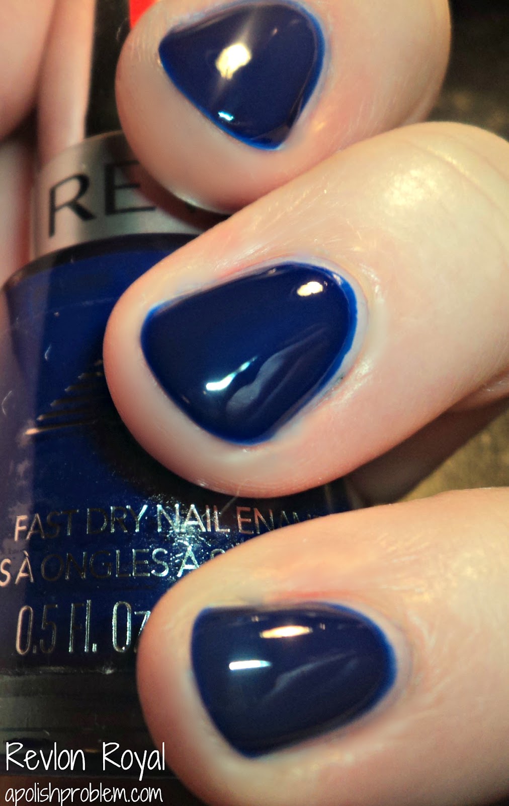
Comparison: Rescue Beauty Lounge IKB:2012 vs Revlon Royal

As I had both of these out due to recent posts, I figured I would do a comparison post...


This picture, and the one above it are both 3 coats of both polishes.  You can see just how much lighter IKB:2012 is than Royal.  Also, you can see some of the formula issues I had with IKB:2012.  It's quite uneven without a topcoat.

This picture is 2 coats of Royal and 3 coats of IKB:2012.  As I was taking pictures of both polishes at 3 coats, I realized that it would probably be good if I showed you a comparison between 2 coats of Royal and 3 coats of IKB:2012, and they are the closest in color at that number of coats.  

As you can see, Royal is a brighter cobalt blue jelly, whereas IKB:2012 is still bright, but it also leans a bit purple, and it has a dustiness to it, that Royal does not.

I know that Ji mentioned on Rescue Beauty Lounge's FB page and on Twitter that IKB:2012 is currently out of stock, pending filling all of the orders.  It may be back in stock after all orders are filled, but no guarantees.  

Revlon Royal is readily available on Revlon's website, as well as through other online outlets, and at drugstores and big boxes nationwide.

30 Days of Blues for Autism Awareness - Revlon Royal

Today is Day 24 in my "30 Days of Blues", and today, I have for you a polish that was a recommendation in several comments in my cobalt blue posts.  Many of you told me that Revlon Royal may just be what I was looking for, and I think you may be right...


This is 3 coats of Revlon Royal, a bright, cobalt blue jelly.  I did 3 coats, because I had a thin spot on my ring finger. If I had waited more time between my first coat and my second, I wouldn't have had the thin spot, as it was from drag.  So it's definitely a polish that can be opaque in 2 coats, just make sure to go slow.  I also recommend 2 coats, if you can, simply because it's brighter at 2, rather than 3 coats.

I'm not sure why I hadn't picked up Royal before.  I'm not a huge fan of Revlon's formula, so maybe that is why.  I also thought it was going to be more of a creme, rather than a jelly.  Not sure where I got that.  LOL.  Anyway, Royal is a perfect cobalt jelly.  I hate to say it, because essentially it means that I wasted $20, but this is so much better, in my opinion, than RBL IKB:2012.  Though, I do need to do a direct comparison between IKB and Royal just to make sure, I think that this polish is what I wanted IKB:2012 to be.

Best part, this Revlon cost me $6 and that was at Walgreen's.  If you can get it at a big box (which the ones around me are always OOS of Royal), it's less than 5 bucks.  

Saturday, April 21, 2012

30 Days of Blues for Autism Awareness - Nubar 2010 over Barielle Berry Blue

Today is Day 21 in my "30 Days of Blues" for Autism Awareness.  Today's manicure is inspired by my complete obsession with Deborah Lippmann Ray of Light.  Seriously.  I stare at every swatch I can find and have my cart loaded on Lippmann's website.

Unfortunately, I've heard not-so-good things about the formula, and I just can't swing $16 right now for a polish with iffy formula.  So, this is my attempt at a reasonable facsimile...


This is 2 coats of Nubar 2010 (a mylar flakie topcoat similar to Sally Hansen Hidden Treasure et al) over 2 coats of Barielle Berry Blue (a deep blue jelly-ish creme).  

I think this would have looked much better if I'd been able to use a true, deep blue jelly, rather than just a polish with a jelly-ish finish.  I tried to layer Berry Blue with 2010 and Berry Blue just covered up the flakies.  There was no "jelly sandwich" effect with this.  So, I opted just to use 2 coats of 2010 over the basecolor.  If I had to do it over again, I would probably go lighter with the flakies so it looks closer to the Lippmann.

I think this looks similar to Deborah Lippmann Ray of Light, but it's by no means a dupe, and at some point, I will probably end up purchasing Ray of Light and then complaining about the thick formula.  If you have a deep blue true jelly, I think you would be much more successful creating a dupe to Ray of Light.

Berry Blue and 2010 are both readily available, and both retail in the $8 range.

Wednesday, April 4, 2012

Nubar Jellybeans Review 2.0

No, you aren't having a case of deja vu, I did indeed previously review the Nubar Jellybeans collection.  However, recently I discovered that one of my pictures from that review, the one for Nubar Blueberry, had been stolen, linked back to this blog, and was being bashed because of my nail shape on a Russian LiveJournal group.  I had wondered why my traffic for that particular post had jumped from approximately 200 views to 1000+ views in a matter of days.  Well... that was why.  :(  I have since removed that post because it was being linked on the LiveJournal group.

At first I was going to ignore it.  No, at first I was going to close my blog and hide in my closet, but I quickly decided that was not the best course of action.  So, I then decided to ignore it.  Then I made the mistake of checking all of my traffic for the past year and I discovered that this was not the first occurrence of this happening.  I found where my blog had been linked on several international forums with the comments "horrible nail shape", "nasty nails", "disgusting", etc... always accompanying the posts.  

As you may know from my previous post regarding my nail shape, my skin is not thick, and I honestly don't know of anyone that likes to read negative comments about themselves.  But at that point, I figured I could no longer ignore it.  I could be upset and I could be heartbroken, and I could be mad (all of which I was), and then I decided to look at the comments constructively, even if that was not their intent.  

You see, I am always trying to grow as a blogger.  From my very first post, until now, 3+ years later, I feel that I have grown by leaps and bounds.  However, that's not to say that there isn't room for improvement.  I feel that you should never settle.  Your next post should always try and be better than your previous post.  With that idea in mind, I took a long hard look at my nails through a constructive eye and decided, that yes... I could better my nails and my pictures.

So I took my glass file and proceeded to rethink the shape of my nails.  I was able to thin out the flare on the sides and really taper them in.  Now, they aren't perfect, but I really do see an improvement.

With that long introduction said, here are the new and improved pictures for Nubar Jellybeans...   

Blue Raspberry - light aqua.  I love this color.  It's so pretty, and one of my favorites for spring this year.  Like I mentioned with Zoya Wednesday, a similar color, it reminds me of sea glass.  As I was applying this one, it really reminded me of RBL Bikini Bottom, though I no longer have that one to compare.  This one had one of the better applications in the collection.  3 coats. 

Blueberry - Blueberry - bright royal blue.  I don't own Revlon Royal, but judging on pictures, it seems very similar, only this one has a jelly-like finish.  I loved the color, and this go-around, the formula was much easier to work with.  3 coats.

Cherry - bright red.  Previously, I didn't like this one my skin.  However, I loved it this time.  It does have a bit of orange in it, but not as much as I previously thought.  his one had the thickest formula and it took me less coats to reach opacity.  2 coats.


Grape - Dusty medium purple.  This purple is quite nice, and it does have a bit of dustiness to it, like Julep Charlotte or RBL Purple Haze, though I think it's no wear near as dusty as Purple Haze.  I didn't really like the formula on this one.  I kept having an issue with it leveling.  Hence, the bumpiness.  And though it's one of the darker colors, it was also one of the sheerest and took me a few more coats to reach opacity.  4 coats.  

Kiwi - light lime green.  I'm calling this a lime, but it's more of a mix between a light spring green, mint green, and lime green.  I kept waffling on my color description, so I just gave up and called it "lime".  LOL.  I did get a slight case of red-hands with this one. This one was sheer, but easy to work with.  Like Grape, I did have an issue with the leveling.  4 coats.

Lemon - daffodil yellow.  This one is brighter than a pale yellow, but it's not a neon.  It's also not a medium yellow, such as China Glaze Happy Go Lucky.  The formula is thinner, but if you go slow and watch your strokes, it shouldn't be an issue.  Now that I've had a chance to revisit it, this one is probably tied with Blue Raspberry as my favorite of the collection.  4 coats.

Strawberry - light pink creme.  This one is very candy-like both in it's color and it's finish.  I really does remind me of strawberry candy.  It did take a few coats to reach opacity, but the formula on this one was very nice, so it wasn't an issue.  4 coats.

Toasted Marshmallow - light brown.  In my previous post, I erroneously called this one "Toasted Coconut".  In the bottle, this brown leans slightly pink, though I didn't really see that on my nails.  The formula was like that of Strawberry and Kiwi.  4 coats.

I still like this collection, probably even more so, now that I've had a chance to re-review it.  The jelly-like finish can be a bit hard to deal with, but nothing that would make me say not to purchase these if there was a color you were lemming (like say Blue Raspberry. LOL).
 
Again, this collection is now available at bynubar.com (as well as other outlets).  Nubars retail for $8 per bottle.

These were sent to me for review

Thursday, March 17, 2011

Nicole by OPI Something About Spring Collection - Pt.1 (Shimmers and Cremes)

Recently, I received Nicole by OPI's Something About Spring collection for review.  I had received the press release a couple weeks ago, and I was immediately intrigued by several of the colors, so I couldn't wait to get my hands on them.  :)  This collection is exclusively sold at Target and Target.com.  This collection is pretty much divided into 3 groups... shimmers, cremes, and glitters.  Today, I have for you the largest group, the shimmers, and the 2 cremes in the collection.  Tomorrow, I should have the remainder of the collection.

First up... the cremes.

Daffy Dill - Bright lime green creme.  This is a very pretty lime green in that it doesn't lean too yellow.  It reminds me of the Fiercely Fiona and Who the Shrek Are You? from last summer's Shrek Forever After collection, but it didn't seem quite as bold as those two.  Don't get me wrong... it's definitely in your face, but it's not day-glow.  IRL, this is one of my favorite colors.  I remember having a t-shirt this color that I wore into the ground.  LOL.  So it makes me smile, it's just a little too bold for me to wear everyday.  Application was fine, though I had to do 3 coats to reach full opacity.


Pink. Seriously. - Bright, blue-based, medium-toned pink creme.  This one isn't crazy unique, by any means, but it's so pretty.  Really pretty.  Seriously, pun intended, I think it's become one of my favorite pink cremes.  Most of my favorite pinks leans to the warm side of the color (which is an anomaly for my pink skintone), but this one is definitely blue-based, and I really like it with my skin.  I can see me wearing this one quite a bit.  Application on this one was perfect.  Pic is 2 coats.

Next is the shimmers, which themselves can be broken down into 2 categories... metallics and jelly(ish) based shimmers.


Sea How Far You Can Go - Champagne metallic shimmer.  This one was a bit of an odd duck to try and describe.  It's a bit champagne, a bit grey, and a bit taupe.  It almost reminded me of Color Club Snakeskin without the frostiness.  This is one of the 2 metallic shimmers.  Formula was fine, but it was thin (which you want to achieve a nice depth to the shimmer).  It took 4 coats to reach opacity.


Shell Me the Truth - Pale shell pink metallic base with golden shimmer.  This is the second metallic based polish in the collection and truth be told, it was a total surprise.  At first, I thought it was going to be your standard shimmery shell pink.  Then I put it on and was blown away by the amount of gold shimmer in this one.  It's overtakes the pink base, but not in a bad way.  This one reminded me somewhat of China Glaze Pink Rox-E, but unlike that one, this one I actually like.  Thing is, pinks with golden shimmer, rarely work on my skin.  This one does.  I love it, and think it's definitely one of my favorites of the collection.  Again, thin formula, but not unworkable.  4 coats.


Dandy Lion - Goldenrod jelly base with tonal shimmer.  This one has so much shimmer that it almost looks like a metallic.  It's not.  It's a jelly base that suspends the shimmer.  I really like the concept on this one, but I'm not a huge fan of the goldenrod color.  It's beautiful, but just doesn't work with my skin.  Thin formula to allow for buildable shimmer.  4 coats.


Pink-Nic in the Park - Pink jelly-ish base with pink tonal shimmer.  This one is so pretty.  It does have a slight purple color shift, but it's not a true duochrome.  I kept thinking, while I swatched it, that you pink-girls are gonna love this one.  It's so pretty for spring and would look great with navy.  Pic is 4 coats, but it was thin and buildable.

These next three shimmers are quite similar while being different colors.  They all have jelly bases and are packed with pink, blue, and purple shimmer.  FYI... I wanted to mention that while I call these and the 2 above "jellies", they are not what I consider *true* jellies because they are able to reach opacity.  However, they had the same "squishiness" of a jelly.  The were kinda similar to OPI's new sorbet finish, just they had shimmer. HTH.


Iceberg Lotus - Green-teal with pink, blue, and purple micro-shimmer.  Okay, first up... I have to mention that my picture on both this one and You're S-teal the One are not color accurate.  I tried, but my little camera just couldn't handle 'em.  :P  Honestly, if you want to see a good idea of this color... look below.  That picture is very similar to the true color of this one.  It's a really pretty green/blue shimmer (that leans more green that blue).  Like the other colors, this one was thin and buildable.  3 coats.


You're S-teal the One - Cerulean blue shimmer with pink, blue, and purple micro-shimmer.  Again... not color accurate.  It's definitely more blue than my picture shows.  It's a beautiful blue that leans a bit teal.  Pic is 3 coats.  The bottle pic on the Target website is actually very close to this one, though perhaps a bit too blue.


I'm a Pool for Your Love - deep purple jelly with blue, pink, and purple micro-shimmer.  Okay, if you are a fan of purple... run... don't walk to Target and pick this up NOW.  I knew I would love this one as soon as I saw the press release and I was not mistaken.  It's absolutely amazing.  The base is a beautiful, vampy, deep purple jelly, but what sets it apart is the gorgeous shimmer.  It practically floats in the base.  If you love purple... you need it.  Enough said.  3 coats.

--

All in all, I like what I've seen so far.  I do think some of the names are a bit silly, but that's neither here nor there.  I still have to swatch the glitters, and there is one that I think is amazing, but for my money... I'm a Pool for Your Love is where it's at.  It is so fantastic.  Like Top 20 fantastic!  I've always thought of Nicole by OPI as OPI's little sister with the not-as-good colors and the funky bottles, but they are really stepping it up.  I know they've recently changed brush designs, and as I had a few straw hairs, I think they are still ironing out those kinks, but aside from that... I think these colors are all a step in the right direction, which is giving Nicole by OPI even-footing with her big sister.    

Again, these are Target exclusives and only available in Target stores and on their website.  They are in the $7 range.

These were sent to me for review

Tuesday, January 11, 2011

China Glaze Anchors Away Collection - Knotty Nauticals (Part 2)

As I mentioned in yesterday's post, like most collections, China Glaze broke this collection into 2 groupings.  Yesterday, I showed you "Sand & Sea", and today I have the second part of the collection, "Knotty Nauticals". Whereas Sand & Sea had more pastels, lighter shades, and neutral shades... Knotty Nauticals is all about the bright shades.


Ahoy! - Jelly-ish finish, bright fuchsia-pink creme with tonal and golden shimmer.  This one is so unbelievably pretty.  It's a bright pink with shimmer, yes, but it's also so much more.  The finish is something really unique.  When I first applied it, I thought it was going the be a jelly, but nope.  It's a creme, with the same squishiness as a jelly.  Pic is 2 coats and the formula was perfect.


First Mate - Slightly-dusty, medium-dark blue creme.  This one almost reminds me of a denim blue.  Y'all know me and blues, so of course, I love it.  The color is very pigmented.  It was almost opaque at one coat, though, I did 2.


Hey Sailor - True red creme.  This one is a perfect 1940's pin-up red creme.  It doesn't lean blue, nor does it lean orange, so it's probably wearable on just about every skintone.  It's also definitely more of a summer red than a fall/winter/holiday red.  It is just a red creme, so it's not incredibly unique, but the name is fantastic.  2 coats.  


Life Preserver - Dusty red-orange creme.  As soon as I read the name on this one, I thought of those big, boxy lifesavers you have to wear when you rent a boat, even down to the slightly-dirty tinge to the orange.  Normally, oranges and I don't play nice, but I didn't dislike this on my skintone.  Formula was a tad on the thin side.  3 coats.

Lighthouse - Yellow jelly with golden shimmer.  Okay, now this is a unique polish.  It's a yellow jelly (yep... the word "jellow" kept running through my mind.  The shimmer in it is is really.  But best of all... it has a great formula.  It is a bit thin, which only allows the shimmer to get more depth, but other than that, there were no issues (like you normally get with yellows).  3 coats.  


Starboard - Shamrock green creme.  Like Life Preserver and First Mate, above, Starboard had dusty finish, and it's definitely more of a yellow-leaning green, than a blue-leaning green.  The color is very pretty and perfect for spring.  The formula was perfect.  2 coats.

--

Now that I've swatched and reviewed the entire collection, I can definitely say that I absolutely love it.  The colors are pretty, with great pigmentation.  There's a variety of finishes, and IMO, not a wonky color in the bunch.  I know I've stated in the past how much I loved Up & Away, but I think Anchors Away just took away it's spot.

The collection is now available for pre-order at TransDesign, with a notation saying that it will be officially available in 1/12 (tomorrow!).

These were sent to me for review

Monday, January 10, 2011

China Glaze Anchors Away Collection - Sand & Sea (Part 1)

As China Glaze Up & Away is one of my favorite collections from 2010, I've eagerly been awaiting their Spring 2011 collection.  I know there been teasers out there since last summer, so it's great to finally see it in person.

Like all regular China Glaze collections, this one was separated into two groupings.  "Sand & Sea" is the more pastel/lighter shades in the collection.


Below Deck - Purple/grey/mauve hybrid creme.  This one is supposedly as close as China Glaze could get to the old, discontinued, and much-beloved neutral, Channelesque.  I've never owned Channelesque, so I can't tell you if it's a dupe or not (check The Swatchaholic for a great bottle comp pic), but I can tell you that I absolutely LOVE Below Deck.  It's one of those colors that I can't describe to save my life, hence the above purple/grey/mauve hybrid description, but it's also fabulous.  I don't have a lot of neutrals, so Below Deck is pretty unique in my collection.  This one is a true creme, without the hidden shimmer like some of the other cremes in the collection.  The formula is perfect, as well.  It was almost opaque at one coat, though I did 2 coats.  UPDATE - The Swatchaholic now has a on-the-nail comparison up.  They look very similar.  

Knotty - Golden beige shimmer base with silver and pastel (pink, green, blue) glass-fleck shimmer.  Judging the bottle, this is one of the two in this grouping that I thought I wouldn't really like.  However, once I put it on, I found myself really liking it.  The shimmer in it is unexpected and very pretty.  Pic is 3 coats.  Formula was a little thin, but nothing unworkable. 


Pelican Grey - Light grey creme with subtle pearlescent shimmer.  Beautiful lighter grey.  The best part in this polish is the "hidden" pearly shimmer.  Usually greys give me cadaver hands, but I loved this with my skin tone.  Formula was a tad on the watery side.  Pic is 3 coats. (UPDATED - I changed my picture of Pelican Grey so it doesn't look like a dupe to Sea Spray)


Sea Spray - Light grey-blue creme with pearlescent shimmer.  Like Pelican Grey above, Sea Spray has that fantastic pearly shimmer, though it's not hidden in this polish.  Of all the polishes in this part of the collection, this one may be my favorite.  I think the name on this one is perfect.  The formula was very similar to that of Below Deck.  Pic is 2 coats, though it was very close to being a one-coater.  

Sunset Sail - Peachy nude creme with pearlescent shimmer.  Yes.  Another one with a pearlescent finish, and that's a-okay with me.  I can't get enough of these polishes with the slight-pearlescence.  Like Knotty, I really didn't see myself liking this one at all.  However, once I had it on, I fell in love with it.  It's a pretty peachy-nude that doesn't look overly-orange against my pink skin (the redness around my fingers is due to the cold and not to this polish).  Pic is 3 coats, and aside from thinness, there were no issues.


White Cap - White jelly with tons of golden glass fleck shimmer.  This one is so pretty and very unique for a non-unique concept.  I know golden-whites or white with golden shimmer are relatively common, but this one stands alone.  Due to the jelly finish, the golden shimmer is able to be suspended in the base.  Plus, it's a little on the thin side which lets you build the color and the shimmer.  Pic is 3 coats.

--

I know I sound like a broken record when it comes to China Glaze collections, but I absolutely love the first 6 in this collection.  And I didn't expect myself to say that.  I thought it would seem a little lacking when compared to last year's amazing Up & Away collection.  However, dare I say that I may like Anchors Away even better?  I love that there is variety in the finishes.  Up and Away was all cremes, and fall's offering, Vintage Vixen, was all shimmers, so I love that this collection mixes it up a bit.

This collection is now available for pre-order at TransDesign, but I know several people have reported seeing it in brick and mortar beauty supply stores.  I should have part 2, Knotty Nauticals, up very soon.

These were sent to me for review

Saturday, December 4, 2010

A few Deborah Lippmann swatches

So lately, I've found myself gravitating towards Deborah Lippmann's polishes.  I recently picked up a few from Apothica.com...


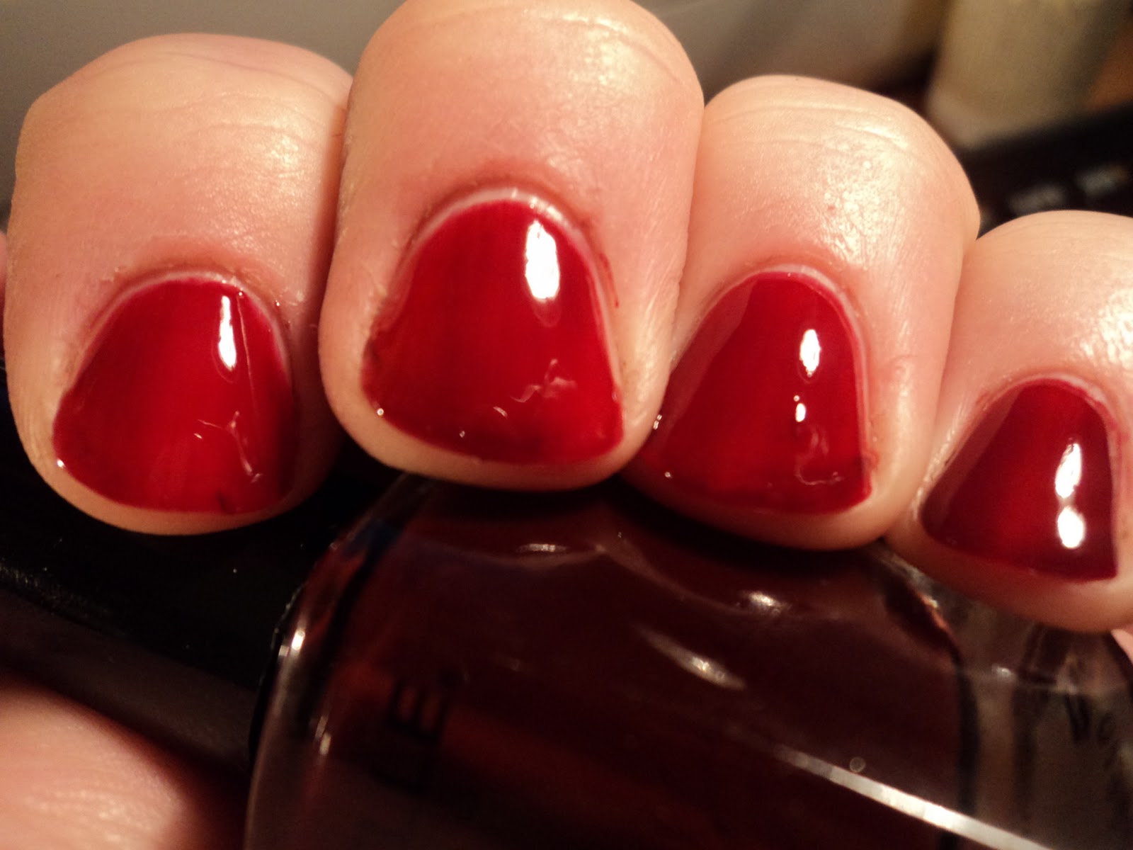
Call Me Irresponsible - Red-purple jelly.  This one looks like grape candy.  I was unable to get full opacity at 3 coats, though, but that's a jelly for you.  Also, the formula wanted to drag, so I had to wait between coats.


It's Raining Men - Bright red creme.  This one came out at the same time as Call Me Irresponsible, and while that polish is a true jelly, It's Raining Men can be described as "jelly-ish".  It was opaque in ONE coat (though I did 2), but there was a squishy-ness to it that you don't get with a regular creme.  Formula was flawless.


Ruby Red Slippers - Black jelly base with red square and hexagonal glitter.  This one is in the same vein as China Glaze Lubu Heels, RBL Black Russian, and Color Club Red Velvet, but this one takes it to an entirely new level.  It's insanely pretty, hence my tweet about stopping my swatchathon and applying it as a full mani.  That said, this is 3 coats and as you can tell, it's crazy bumpy.  Seriously, after 2 coats of TC, my nails still looked like little relief maps.  A third coat of TC fixed the bumpiness, but also left the polish gooey.  I think my problem however, was in my TC (Nubar Diamont).  Next time I use this, I'm using a thicker quick-dry (i.e. Seche Vite).  


Wicked Game - silvery purple-green duochrome metallic.  Okay, I'll admit it.  I picked this one up because it was named after the Chris Isaak song from my youth.  I love that song.  Almost 20 years later and it's still gives me chills (because of all the haunting emotion he stuffs in it).  Unfortunately, of the 4 I picked up, this one was the one that disappointed me.  I've seen pictures of it looking amazing on girls with actual pigment in their skin.  It just didn't work with me.  It washed me out and I washed it out.  Beautiful polish with a nice formula, but it and Megan don't play nice.  :(  3 coats.

I've also purchased a bottle of Boom Boom Pow (again because of the title) which I will swatch as soon as it gets here, and based upon my love of Ruby Red Slippers, I'm thinking about picking up Bad Romance and, if can find it outside of the boxed set, Razzle Dazzle.

Deborah Lippmann polishes are in the $16+ range (more for glitters) and are available at www.deborahlippmann.com and online beauty boutiques like www.apothica.com.

These polishes were purchased by me using a GC from Apothica.com

Saturday, October 23, 2010

New Barielle Ulta Line

I recently had the opportunity to review Barielle's new Ulta line.  This line, currently comprised of 16 core colors and 2 seasonal collections, is available at Ulta brick and mortar stores, as well as at Ulta.com.  This post is quite long (but you can ignore my jabbering on and just look at the pictures.  LOL :P), as I'm putting all 28 colors and reviews in one post.  Also, as, save for the Holiday collection, I swatched the entire thing in one fell swoop, so my cuticles are looking very ragged (sorry, I tried to keep them in check).  Hopefully, that won't detract too much from the pics, as there are some really beautiful colors in the mix.  Additionally, I wanted to mention on the front-end that formula on almost all of these was great, and a big improvement from Barielle's sometimes way-too-thick formula.  Many of them, the cremes and the jellies especially, practically flowed on the nail, though I very little difficulty with any of the formulations.

First up, I have one of the 2 seasonal collections in this collection, Barielle's fall offering, Style in Argyle.    

Angora Aura - Warm golden mustard.  I think of all the colors in this fall collection, this is the one that appealed to me the most, and I think that's mainly because of it's weirdness.  You don't normally see colors like this, outside of a few here and there.  While it's nowhere near the same color, it's in the same vein as RBL No More War.  It's weird, dirty, and definitely different.  I think this one would look beautiful this fall with a purple sweater.  2 coats.


Cashmere or Loose Me - Medium pink-based brown with pink and gold microshimmer.  The lone shimmer in this collection.  It reminds me of Jessica Bittersweet, though the colors are definitely different enough to justify owning both.  The name is a little odd, I think it should be Cashmere or Lose Me, but that's neither nor there.   2 coats.


Cowl of the Wild - Dirty, olive-based brown.  This, like Angora Aura, is another dirty-weird color.  This one would look great with golden shades or even red.  2 coats.


Tight Knit - Nutmeg brown.  This one has a fair amount of pink in the bottle, though if doesn't really translate to the nail.  2 coats.


Unraveled Rust - Warm chocolate brown.  Looks like melted milk chocolate.    Don't let the name fool you, this one is not "rust", but once I realized that the name on this one was a play on Unbridled Lust, I thought it was really cool.  LOL.  Formula was very smooth.  2 coats.

Wool You Marry Me - Burgundy-based brown.  This one is a little different that the other colors in the collection, in that it was slightly cooler.  This one would be beautiful paired with navy for fall.  2 coats.

I know this collection as gotten a bit of a bad rap, as it's mainly just a jumble of browns, but I really like it.  There is a brown in here for everyone and a weird, dirty mustard color for those of you that like to be outside of the status quo.  This collection is currently available at Ulta stores, and at Ulta.com. 

Next, is the second seasonal collection, Holiday Hustle...


Coalest Day of the Year - Charcoal grey metallic shimmer.  In terms of metallic-y-ness, this one is actually on the more subtle side.  The color itself reminds me somewhat of Orly Iron Butterfly with a TC, though Coalest Day of the Year is definitely shinier.  This is a very chic color and would look great on short, squared nails.  2 coats.


Elle's Spell - Deep red jelly with gold/green/orange holo flakies.  This one went on very sheer, but was buildable.  Pic is 3 coats, and you will need that many to reach opacity, but to also give depth to the flakies, which incidentally, I found to be more uniform that other flakies I've tried (i.e. OPI Merry Midnight... I don't have any Nfu-Oh flakies to compare).  This is a beautiful color for the holidays.

Gelt Me to the Party - Old gold frosty metallic.  In the bottle, this one has subtle ribbons of light gold shimmer, which don't exactly translate to the nail.  I'm pretty sure those shimmer ribbons are what add to the frost effect.  Unlike the other 2 frosts in this collection (see below), this one had the least issues with brushstrokes, though they were still there, so you will still need to watch your strokes.  As for the name, I'm pretty sure this is either supposed to be "Get Me to the Party" or "Gilt Me to the Party".  2 coats.


Snow Day - Silver frosty metallic.  And when I say "frosty", I mean FROSTY.  This is probably my least favorite from all the Barielles I reviewed in this post.  In the bottle, it's beautiful... a pale, icy blue-silver metallic with silver and blue shimmer ribbons.  Sadly, it just doesn't translate.  I'm not saying to count it out, as the color is pretty, but you will have to use a sticky base coat, and go slow between coats minding your brushstrokes in order to make this one work, IMO.  2 coats.

Wrap Me in Ribbon - Mauve pink frosty metallic.  Compared to Snow Day, this one is more like Gelt Me to the Party.  The brushstrokes are manageable, and it has a faint golden pink shimmer to set it apart.  It's nice to see a paler pink included in a holiday collection.  3 coats.

Jess' Champagne Toast - Lavender-grey foil with pink microglitter.  I honestly think this one is my favorite of the Holiday polishes.  That's not to say it doesn't have it's down points... the base is a tad too thick to let all the microglitter shine through (though to be fair a good amount of it does peek through).  However, when compared to another similar polish, CC Ms. Hautie, this one actually works.  Yes, it is more amazing in the bottle than it is on the nail, but I still fell in love with it.  I wore this as a mani and I kept parakeeting my nails all day long.  You will need several coats of TC as this one has a tendency to eat it up (I think I ended up with 3 coats of TC after all was said and done).  3 coats.

This collection had me torn.  I love Jess' Champagne Toast and Elle's Spell, though I thought there was maybe one (or two) too many frosts.  I just checked and this collection is currently not available at Ulta.com, though I expect it will pop up within the next few weeks.  I've you've spotted it at your local Ulta B&M store let me know and I will update this post.  I just don't have an Ulta in my area.  

And lastly, I have the 16 core colors (shades the Barielle brought over from the existing collection)...

Belly Dance - Greige base with pink, blue, and silver microshimmer.  The shimmer is what keeps this one from being your run-of-the-mill greige polish, though it is more pronounced in the bottle than on the nail.  2 coats.


Berry Blue - Inky blue jelly.  Le Sigh.  We all know that Megan loves blue, and this color is no exception.  It actually looks like blueberry jam.  I love everything about this color... the finish, the tone, the application.  Well, it does give you smurf fingers, so I don't like that, but aside from the inherent smurfyness, it's a gorgeous shade, probably my favorite of the core Ulta colors.  2 coats (with a thinner 3rd coat on a couple nails to even it out)


Coco Bar - Deep, rich cocoa brown.  This one is deeper in tone, and in richness than Unraveled Rust.  It literally looks like cocoa powder.  I love this color.  2 coats.

Decadence - Teal green shimmer.  This color is amazing.  It's along the same vein (in tone, not in finish) as CC Untamed Luxury.  2 coats.

Ecstasy - Bright, clear red jelly.  I would call this a pin-up red.  It's clear and bright and true, meaning it doesn't clean orange or blue.  I love a jelly red that doesn't leave me with VNLs and this one fits the bill.  2 coats.


Euphoric - Orange-based, salmon/cinnamon brown-hybrid creme.  How difficult could I make this description?  LOL.  It's too orange to be a salmon and too light to be classified as a cinnamon brown.  I would classify this a "mom" color.  It's pretty, but doesn't really work with my skintone.  2 coats.


Expressive - Light lavender-pink creme.  Seems like a cross between OPI Lucky, Lucky Lavender and Panda-Monium Pink.  2 coats.


Flirtini - Bright magenta jelly.  Another jelly that doesn't leave you with VNLs.  2 coats.


Grape Escape - Medium-toned purple creme.  I know we've had a few purple cremes pop up in the last year or so, RBL Mismas, ChG Grape Pop, and OPI Funky Dunkey.  However, this one seems more like RBL Purple Haze.  Granted, it doesn't have the smokiness of Purple Haze, but the base tone is more similar.  If you love purples, you will love this one.  I think it would look amazing with yellow.  2 coats.

Lust - Deep red jelly.  This one is Ecstasy's older sister.  Definitely darker and sexier, but still bright and clear.    This one leans a little blue.  It looks much darker in the bottle.  2 coats.


Misbehaving Mistress - Grey-brown shimmer with silver ribbons.  I found this color to be a bit odd.  I don't think it worked with my skintone.  Also, the silver ribbons made it a tad frosty on the nail.  2 coats.


Out-grey-geous - Light grey metallic shimmer with golden shimmer particles.  This one reminded me of a grey version of CC Snakeskin.  The color is pretty, but I found the formula to be a little hard to work with (it's thin) and because of that, it has a tendency to be brushstrokey if you don't let it dry between coats.  Pic is 3 coats.


Pink Sherbert - Pale shell pink shimmer.  I like this one because it's a pale polish that is opaque in 2 coats.  You don't have to baby it and you don't have to apply it over white or apply a 1000 coats in order for it took look great.  This is a great work-safe color.


Sailors Delight - Light, warm, creamy pink.  Like ChG Sugar High and OPI ElePhantasic Pink's baby sister.  This one seems like it would have the ability to compliment every skintone.  Also, like Pink Sherbert, the formula was thick enough to be perfectly opaque at 2 coats.  I can't say how much I love that in a light polish.  Plus, I adore the name... "pink sky at night... sailor's delight".


Slate of Affairs - Grey-blue shimmer with purple/blue flash.  Maybe it's the purple/blue flash in this, but a part of me wants to call this a deep periwinkle shimmer.  It definitely doesn't seem like a slate blue, IMO.  But at any rate, it's a gorgeous color.  I can't wait to wear this one as a full mani.  2 coats.

U-Concrete-Me - Medium grey creme.  This one is pretty straight-forward.  It's a grey creme.  Not too much to say about it, though the formula was nice.  Also, I think it would look gorgeous with icy and pale blues.  2 coats.

Whew.  If you stuck around that long... Thanks!  :)  This is a great line.  I kind of wish that Date Night and Swizzle Stick had been included, but I think they hit all the main points with this collection of polishes.  Also, I know the majority of us don't have a problem with ordering polishes off the internet, but if you do, I think this is perfect for you.  It makes Barielle much more accessible (provided you aren't like me and don't live in the land Ulta forgot) and gives you to see the polishes up close and personal.  Of course, if you do want to order them online, save for the Holiday line, which I would expect to see soon, all the polishes are available at Ulta.com (though they don't have Barielle in their Brand drop-down, so you will need to search).  Also, they are B2G1F through the month of October.  Retail price at Ulta is $6.

These were sent to me for review