Showing posts with label peach. Show all posts

Sunday, June 10, 2012

Deborah Lippmann Daytripper

Recently, I have become a little obsessed with Deborah Lippmann's polishes.  I am starting to love everything about them, from the stable, signature square bottle, to the shape of the handle, that fits  perfectly between your fingers for maximum control, to the color range.  In the past month alone, I think I've picked up 10 new Lippmanns.  :|  Thankfully for my wallet, most of them were either acquired from the clearance sale on HSN or by using my Apothica.com giftcard (which I receive as part of my site sponsorship with Apothica).  

One of those polishes I purchased from Apothica was Daytripper...


Daytripper is a bright melon jelly-ish creme.  The finish and formula on this one was very similar to that of the OPI sorbet polishes from last year's Texas collection.  Because of this, it took 4 coats to reach opacity on this one.  After the third coat, I still had a few thin spots, so when I had to apply that fourth coat, I got very worried that it would remain gooey on my nail and wouldn't dry.  However, after one coat of Sally Hansen Insta-Dri, it was completely dry in about 20-25 minutes.  So, this is one of those polishes that can handle several coats, if necessary.  

The color on this one is so pretty, and I actually think it's unique in my collection.  At first, I thought it was going to be too warm for me, but after putting it on, I see that it has just the right balance of peach and pink for just about every skin tone.  I think it is a perfect color for summer.

Deborah Lippmann Daytripper is a part of her regular line-up and should be available anywhere you find Deborah Lippmann polishes.  I always get my Lippmanns online and my favorite places to purchase them are Apothica.com, Zappos, and What She Buys.  


Daytripper was purchased by me using an Apothica.com gift card that I received as part of my sponsorship agreement with Apothica.  The above links link to various sites to purchase this product and are not affiliate links.


Monday, May 7, 2012

Jessica Bliss is This! Bridal Collection Review

Today, I have for you Jessica's 2012 Bridal Collection for review.  This collection consists of three polishes that, per Jessica's press release, are designed to complement the Big Day.  


Desire - is a dusty, medium-toned, red creme.  2 coats.  I think this would be the perfect red for someone, like a bride, that wanted to wear a red polish and yet didn't feel entirely comfortable with fire engine/tomato/hooker red on her fingertips.  My mom, who only wears neutrals, would love this color.   Also, I found it to be really flattering with my skin tone.  I did have a little issue with the formula as it was a little stringy, but it was easy enough to control.  I did have to be careful not to apply the coats too thick, as that made the stringing worse.  2 coats.


Flirtation - light, tea rose pink creme.  No, this color isn't unique, but it's still really pretty.  I love this one.  Love.  There is just something about it that is so light and girly.  Flirtation is the perfect name for this polish.  I can totally see this as a wedding day color.  For me, this one had the best formula in the collection.  It flowed on the nail very nicely and I was able to reach opacity in 2 coats, which is something I love in a light pink.


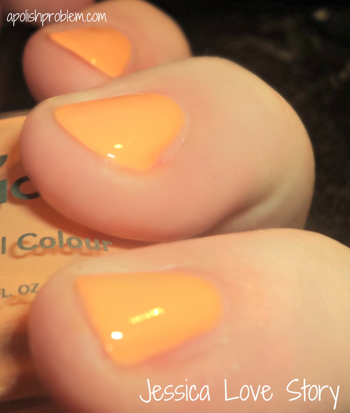
Love Story - light, yellow-based peach creme with a jelly-ish finish.  Love Story is my least favorite of this collection, simply because the yellow in the base of this polish didn't work with my skin tone.  Although, if you have darker skin or olive-toned skin I think this one would look beautiful.  The formula was the thinnest of the collection and it took me 3 coats to reach opacity.  


Now, I realize that these colors are not incredibly original.  But, normally, when you think of a bridal collection, you think of pale white-pink cremes or French manicure shades, so I like that this collection is a little outside of the box in that regard.  Also, these appear to be dupes of Chanel's Spring 2012 colors, April, May, and June.  I know sometimes dupes get a bad-rap, but I frankly love it when someone dupes a $26 Chanel.  :P  Plus, aside from Love Story not working with my skintone, they are all super pretty, and sometimes, being "just pretty" is good.  :)

Jessica polishes are available at Jessica Cosmetics' website.  However, I just checked and they aren't currently available.  The press release states they will be available starting April 2012, so they should be available soon.  


Jessica Bliss is This! collection was sent to me for review.  The above link is not an affiliate link.

Friday, November 11, 2011

Curtsy & Bow

A couple of months ago, I was asked by Curtsy & Bow's PR to review their products. Given my love of new brands, I was all over it.

I received 2 colors from their debut collection, "The Yacht Club" collection. The inspiration behind this collection was the creator's, Melissa Huynh's, travels throughout the caribbean.

Here's a list of all of the colors in the collection:
Intimate Sand is a powder pink solid lacquer
Shell We Dance is a peach/coral pink solid lacquer
Wasap-bi? is a Khaki/Green Solid lacquer
St. Thomas Blue me Away is a powder blue solid lacquer
Shiraz with tha Stahz is a deep wine with silver speckles lacquer
Supernova Girl is a silver glitter top coat
Jetset In My SunSet is a gold glitter top coat

I received Intimate Sand and Shell We Dance...


Intimate Sand - soft pink. This one is a pale pink, but it's not sheer. The color was extremely pigmented. I always find that I love the color of pale pinks, especially in early spring, but I hate the fact that it takes a gazillion coats to reach opacity. And if you do get one that is opaque in just a few coats, it looks chalky. This one only took 2 coats to reach opacity and isn't chalky.


Shell We Dance - creamsicle orange. I know Curtsy & Bow describes this as coral/pink, but on me, it definitely looked like the color of orange push pops. It's a pretty color, but with my pink skin, it seemed a little off. I think this would look fantastic on someone with darker skin.  Two coats.

I liked these colors. I felt that the formula was a bit thick and I thought the brush was a bit hard to handle, but I got the hang of it after a few tries (the handle is very short).   I really liked that they were opaque in just a few coats.  My favorite was definitely Intimate Sand.

These retail for $15 (I think) and for more information, you can view their blog.

These were sent to me for review

Friday, February 18, 2011

Adoree Polishes

Recently, the great folks at Esther's Nail Center sent me 5 Adoree polishes to swatch and review.

Unlike usual, I applied all these polishes over a sticky basecoat (Amour).  Some were thin so it made everything flow better.

Also, as Esther's lists Adoree by number first, I've included that with each review.


166 Deep Purple - Tyrian purple shimmer with red and blue shimmer particles.  This is a deep, rich, and regal vampy purple shimmer.  When I first saw it in the bottle, I thought I wasn't going to like it, as I saw silver ribbons.  And silver ribbons usually equate to frosty mess, but I was pleasantly surprised.  There is a bit of frosty sheen to the finish, but it's not brush-stroke-y and it's not unflattering.  This was one of the thicker formulas that I tried.  Pic is 2 coats.


216 Fruit Shake - Pale milky peach with silver microshimmer.  Okay, when I say "microshimmer", I mean microshimmer.  The shimmer is definitely there, but because it is so fine, it tends to sit on top of the polish, giving the finish a slight pearl effect.  It's not a pearl polish, but it does have a bit of a pearly sheen.  I think this is a beautiful color, although it doesn't really work with my pink skin.  I think it would look fabulous in the summer with tanned skin.  It reminds me of a peach milkshake.  The formula was pretty thin, but it was manageable.  Pic is 3 coats.


191 Harbor Brown - Medium-toned brown frost.  In the bottle, I thought this was going to more of a muted chrome, but once I put it on, it was full-on frost.  The shade is pretty... a slightly warm, pink-based brown, but I didn't really care for the finish.  I went very slow and was careful with my strokes, but you can still see strokes, which is just the nature of the frosty beast.  The formula was nice.  2 coats.


165 Ivory Tusk - Golden ivory shimmer.  This is another one I think would perfect on darker or tanned skin.  It's sheer so it would either need to be worn as-such or be used as a top coat.  I think this would look great over red or deep purple.  3 coats.


Tahitian Pearl - Grey-green/purple duochrome.  Unlike the other polishes in this post, Tahitian Pearl is LE.  Also, it doesn't have an item #.  It's the first polish listed in their Adoree selection.  If you love anything duochrome-y, you are going to LOVE this one.  The green/purple flash on this is gorgeous.  The catch?  Of course there had to be a catch... it's extremely thin.  Like if-the-color-wasn't-so-amazing-I-wouldn't-fool-with-it thin.  This picture is 5 coats.  I would normally never recommend a 5-coat polish, but the coats on this were very thin and it dried quickly.  After I applied the last coat, I added a coat of SV and within minutes it was dry.  So, while it is many coats, it's also not out-of-the-question.  It's so pretty, I say it's my favorite of the 5 despite the thinness.  It does look nice layered, but that has a tendency to change it from a duochrome to a shimmer.

In the US, Adoree is exclusively available at Esther's Nail Supply (at least I think it's exclusive).  I haven't seen it elsewhere online and I'm not sure if it's sold in B&M supply stores.  Adoree retails for $6 each and Esther's offers free shipping over $89 (they carry CND Shellac and a bunch of other supplies as well).

These were sent to me for review

Sunday, April 18, 2010

Color Club Pardon My French Collection Part 1

I picked up this collection at Ross about 6 weeks ago.  I had the text of a post all typed out and then I went back to review my pictures and they were all so bad, I couldn't post them.  I figured if I wanted to do this collection any sort of justice, I'll have to wait until my nubbins grew out a little more and until I had a bit more time in which to swatch, take pics, review, and post.

This is a confusing collection, in that the name is misleading.  Given the name "Pardon my French", you may assume it was a collection of polishes to be used for French manicures.  Um... not so much.  LOL.  It's a collection of 2 opaques (well one opaque and one almost-opaque, 2 semi-sheers, and 3 glitters).  Truth be told, I didn't really like the look of this collection when I got, but 1. I wanted Take Me to Your Chateau, so I figured for a few bucks more, I could review the entire collection and 2. I think part of me just bought it because I actually found a CC collection at Ross... something that'd been eluding me for months.  Unfortunately, my opinion hasn't changed all that much, save for 2-3 polishes.  I haven't seen much press on this collection, aside from a couple blog reviews, so I hope this will help someone that sees it on an etailer's website and wonders what it's all about (just like I did). 

Today, I'm going to show you the cremes and tomorrow will be the glitters.  I suppose this collection was meant for layering, but I don't really like layering with CC's holo glitters (for some odd reason), so unless someone posts a request for me to layer 2 particular polishes, I'm going to not layer these.

Okay... without much further adieu (ha.French.ha), here are the cremes....
Oh Naturale. Let me go on and start with my least favorite first.  Oh Naturale is a pale, sheer, orange-y peach.  It almost looks like a dreamsicle orange, but there is a bit too much yellow in it to be that shade.  It almost reminds me of the color of apricots.  I really don't like this color.  I think on my skintone, it's extremely unflattering.  Perhaps if you have a tan or a darker, less pink, skintone, you may be able to make it work.  However, it's very streaky.  This is 2 coats and you can still see big streaks.  Hovever, I wanted to try and do this color some justice and see if additional coats would help.  Below is 5 COATS and it's still not fully opaque and even in application. 

Sorry girls, I think this one is a pass.


Pardon My French.  This one is a pale milky pink and is pretty in theory. I have no problem with sheers, but it was way streaky, just like Oh Naturale.  I was able to combat the streaky-ness some what by using thin coats, but they were still there.  However, I do like the color, so if you use a base coat and are careful to let coats dry in-between, you may be able to get this one to work for you in 2-3 coats.  Pic is 2 thin coats.


I Believe in Amour.  This one is a pale, dusty rose, with a milky quality, like Pardon My French.  It's a beautiful color, but it was still streaky and not opaque at 2 coats.  Although, I love this one so much, I tried it with a base coat and gave it 3 coats and a bit more time and I think it's very doable (pic below).  I plan on using this one as a full mani in the future.


I saved the best creme, and in IMO, the best in the collection, for last...

Take Me to Your Chateau.  This is an amazing pale blue.  It's opaque in 2 coats and very pigmented for a pastel.  In the pic, it looks like it may lean a bit turquoise, or green, but that's not the case.  It's a straight-up pale blue  This was 2 coats, though it was almost opaque in one.  If you been looking for a perfect pale blue, definitely pick this one up.  I plan on having a pale blue comp post w/in the next few days. 

All in all, I found myself torn on these polishes.  I love, love, love Take Me to Your Chateau.  I also like the colors of I Believe in Amour and Pardon My French, but the formula requires patience and time and it's not effortless like TMtYC.  As for Oh Naturale... for me, it's a pass.  I really don't see how it could work for anyone given the streaky-ness, but if you love the color, you may be able to make it work with a good sticky base coat and time between (thin) coats.  Also, aside from TMtYC, these required thin coats.  If I put too much on my brush, it was very globby and hard to keep it from pooling on the nail.

Tomorrow, I will post the glitters in this collection, so stay tuned.  :)

Tuesday, December 8, 2009

ChG Up and Away Swatches

As I mentioned yesterday, I received samples of the new ChG collection, Up and Away. I took these yesteday, and I tried to take sun pics, but it was so overcast here, that my outside pics looked the same or worse then my inside pics. So, last night, while my husband was out gaming and my children had gone to bed, I re-swatched the entire collection indoors in my kitchen.


I want to give you fair warning that these will probably be the worst swatches you will see of this collection. I'm a total newbie at this with my new nubbins. It was hard to know how much polish to apply since I couldn't just take it off the free edge (I have no free edge to speak of). Also, this is the first time I've actually swatched a full collection, so there's definitely a learning curve. If I didn't love the collection so much, I would have just waited, but I really wanted to show these colors off. They are that beautiful. I promise that before this collection comes out, I will revisit it with, hopefully, longer and less ridge-y nails. The colors, however, are pretty accurate.  Though, I did have two that didn't come out as the right color no matter how many pics I took.
I'll do them in the order of the bottle pics I took and posted earlier.


L-R: Something Sweet, Sugar High, Peachy Keen, Lemon Fizz, Re-Fresh Mint, and Light As Air


Something Sweet – ChG describes this one as “cotton candy” and I think that’s a pretty good description. It’s a very sweet, pale pink that actually looked good on my pale skin and short nails. The closest thing in my collection was CC Vintage Couture. The colors are similar, but VC looks like it has more white in it. Because of this, it also looks chalky when compared to Something Sweet. It’s a beautiful Easter Egg color, and while it is a pale pink, because it was so opaque (I had to use 3 coats, but that’s more user error than anything), it doesn’t look like your everyday pale pink.


Sugar High – This one was listed as “petal pink”. Honestly, I got the description for this one and Something Sweet reversed and I thought this one was “cotton candy”. I can understand that more than “petal pink”. In reality, it’s a bright Barbie pink. It’s very close to OPI ElePhantastic Pink from last year’s India collection. The only difference is that EPP is more of a warm, creamy, Barbie pink, where Sugar High is just a creamy, Barbie pink. It does not lean warm. If you have EPP, and want to avoid like polishes in your collection, Sugar High is definitely dupe-y enough to not warrant purchasing it. However, if you love mid-tone pinks, I would pick it up no matter what. As much as I love EPP (and it’s probably my favorite pink), I think this one has surpassed it. The formula is far superior. I find EPP to be very watery, and this one is thicker and smoother. This is two coats.


Peachy Keen – This one is listed as “nectar”. When I immediate saw the color on, it looked like an orange creamsicle on me, so it took me awhile to get the nectar thing. But the more I stared at it, the more it looked like apricot nectar, especially indoors. Unfortunately, it’s too warm for my pink skin and it just doesn’t work. It’s a pretty color and would look great on someone with a tan. This was 2 coats.


Lemon Fizz – “Banana”. I found it odd that ChG named the color Lemon Fizz, yet described it as “banana”. I can see why they did it, because it’s more of a banana yellow, than a true lemon yellow, but IMO, it looks just like lemon sorbet. It’s a very light and cheerful color. I’m not a huge yellow fan, to be honest. I’ve owned a FP yellow in the past and I still have BB Couture Kokomo, but that’s more of a buttercream color than a true yellow. This one is definitely yellow, but I think it’s a very wearable yellow. It doesn’t scream “hey, I’ve got yellow fingernails!”, though. I actually liked it on me, and normally I think yellow and I don’t get along. It also reminds me of the color of my twins’ former nursery (that’s now my daughter’s room), so the whole time I was applying it, I was smiling. This is 2 coats.


Re-Fresh Mint – This one is listed as “spearmint”, and I think that’s another good description. R-FM, along all the paler colors, really looks like buttermints. I loved this color in the press release, and in the bottle, but I was really skeptical about it on. I’ve tried several mint greens in the past… OPI Hey! Get in Lime and Essie Mint Chintz, both of which looked like utter crap on me. They made the skin around my fingers look red and dirty. This one, however, did not. I’m not sure why, though. Normally, a lighter green has to have a bit of blue in it to play nice with my pink skin. R-FM has no blue in it, and it looks like it’s a yellow base. I don’t get it, but I sure like it. It’s magic! If you are dying to wear a mint green but avoid them because they don’t work with your skin, consider getting this one. It’s truly perfect. It also killed my lemming for Essie Mint Candy Apple, and I’m glad for that since I prefer ChG’s formula. This is 2 coats.


Light As Air – This is another one that I don’t get the description. ChG states this is “periwinkle”, but IMO, it isn’t blue enough to be periwinkle. Don’t get me wrong, it’s an amazing color. Just not periwinkle. Seriously. Where has this been my entire life. For years, I’ve tried to find the perfect opaque lavender crème. It looks great with my pale skin without making me look like a corpse. This was three coats, but again, as with Something Sweet, that may be user error.


L-R: Heli-Yum, High Hopes, Happy Go Lucky, Four Leaf Clover, Flyin' High, Grape Pop


Heli-Yum – “Raspberry”. Again, ChG is pretty dead on with their descriptions on most of these. This one looks like the crème version of OPI California Raspberry. It looks a bit lighter and brighter than CR, but they are definitely cousins. It’s a very juicy color. It looks like the raspberry sauce you get with the Great Wall of Chocolate at P.F. Chang’s. Mmmm. I love it with my skintone. Application on this one was amazing. It was one of the two that was a one-coater.


High Hopes – This one list called “guava”. It does look like a brighter version of the guava cubes in a tropical fruit salad.  Guava also gives me a general "tropical" feeling and I think this color has it.  However, if I were doing the describing, I would have called it coral. Bright coral, to be exact. This is exactly what I wanted CC Sexsea to be. While Sexsea turned out to be a bright, orangey red on me, this one is truly a coral. As I’m typing this, I have CC Sexsea, OPI Cajun Shrimp, and High Hopes side-by-side, and I have to say that this one is my favorite. It’s definitely on the warmer side, but not nearly as orange as the other two, which makes it work with my pale, pink-based skin. This is a perfect summer color and would look amazing as a pedi. This is 2 coats.


Happy Go Lucky – It’s labeled as “sunshine yellow” and they weren’t even kidding. Like with Peachy Keen, I wasn’t really a fan of this one. It’s a pretty color, and on someone with a tan, who could rock out a bright yellow, it would look gorgeous. It just looked really weird on me.  Though, I may get a wild hair and wear it in the summer anyway. It’s a very bright, though not neon yellow. I’ll say though, that I know yellow formulas get a bad rap, but this one applied just fine. Any streaking that was there was gone with the second coat.


Four Leaf Clover – ChG calls this one “kelly green”, and it’s dead on. You can’t tell at all from the picture, as this one was a total beast to photograph.  It's definitely NOT the weird bluey/green/turquise in the picture.  I swear I tried like 100x to get a good pic.  You’d think it was a purple, it was that hard. This one really reminded me of Illamasqua Elope. I’d been secretly lemming Elope for sometime, but I’d been avoiding it due to the fact it was a brighter green, and because it was available in the UK only. Now, that I have FLC, there’s no need to order Elope (and I was seriously considering it when I was able). Also, this green, like R-FM actually worked well with my skin. It’s a very happy surprise. This is 2 coats.


Flyin’ High – “Teal”. Well, hello luvah. *gasp* I’ve been lemming teals pretty hardcore lately. I’ll buy them in just about any incarnation. And while I’ve yet to shell out the big bucks for RBL Teal or Illamasqua Muse, if it’s a teal, and cheap… I’ll get it. In the pic, this one looks like a sky blue, kinda similar to ChG Sky-High Top. It’s not. It’s definitely a teal rather than a blue. It’s a mid-tone, dusty teal. It’s much more similar to Misa Dirty Sexy Money, with DSM being slightly greener and dustier. I loved this one so much; I think I could wear it for days and not get sick of it. It looked nice with my skin as well. It’s also killed my lemming for Muse. Gotta love these lemming killers. This was 2 coats.


Grape Pop – ChG describes this one as “bright plum”. I don’t really get plum from it, though. When I think of plum, I think of a purple with a lot of red. This one is a true purple. It’s like the color of grape candy. If there was such a thing, I’d call it an opaque jelly. It has that candy look of a jelly, but it’s not transparent at all. Awhile back, I bought Misa Sorry Just Can’t Help It to be a stand in for RBL Mismas. I love the color of Mismas, but I just couldn’t pull the trigger on an $18 purple crème. Now, I don’t own Mismas, but this one looks to be very similar, if a bit darker. It’s definitely squashed my lemming. This was the other one-coater.

Again, I want to apologize for the state of the pics, and for the state of my nails (though I think they are actually starting to look good), but I really wanted you all to see just how amazing these colors are.  Seriously, there's not one I can't stand.  If I had to pick a least favorite, it would probably be Peachy Keen, but that's just because it looked gross on me.  It's still a beautiful polish.  If I had to pick a favorite, well... just shoot me now.  I love just about all of them.  I guess the numero uno would be Flyin' High, but Light As Air, Grape Pop, Four Leaf Clover, and Re-Fresh Mint are all up there, too.  The formula on all these was great.  I had a few issues, but I think that's just because I'm not used to polishing on my natural nails and short nails, to boot.

Just in case, you missed my post earlier, I emailed Irene to ask when this would be available and she said mid-January.  I'm pretty sure it's going to be available at Sally's and all the regular etailers.

Special Thanks to China Glaze