Hi all, sorry for being MIA for a few days. Usually, I do the majority of my blogging over the weekend and then schedule the post to go live during the week. At least, that's been my system over the past couple of weeks. And, it was going well until I wasn't able to sit and create blog posts for a few hours on Sunday. Anyway, I do plan on working on posts over the weekend, so you should see something soon.
EDIT on Monday - In order for one to photograph nail swatches, one has to have their camera battery charged. One forgot to check for that before one swatched RBL 360 (:P), so I'll have to start over tonight. Hopefully, I'll get some swatching/photographing done tonight, as I don't want to have been lags in the blog like I did before.
Friday, April 30, 2010
Monday, April 26, 2010
Nicole by OPI Spring 2010 New Releases
Believe it or not, I've never tried Nicole polishes before. I think it's always been a combination of the price being almost $7 for a drugstore polish and the weird bottle (I know... shallow). However, I recently had the opportunity to review the new spring releases for Nicole, so I was pretty excited to try my first Nicoles, and these did not disappoint.

I Stop for Nicole is a bright cherry red, glass-flecked shimmer. This is such a cheerful color. It really reminds me of ChG Raspberry Festival (comp to come soon). This took 3 coats to reach opacity and in brightl light, VNLs are still visible.


I Stop for Nicole is a bright cherry red, glass-flecked shimmer. This is such a cheerful color. It really reminds me of ChG Raspberry Festival (comp to come soon). This took 3 coats to reach opacity and in brightl light, VNLs are still visible.

Yellow it's Me is a bright yellow shimmer. This one is probably the most unique of the collection and the most unique yellow I've seen. You can barely see it in the picture, but the shimmer in this one is orange and red (it's most visible on my index finger). Unfortunately, as much as it's different, it's also disappointing. This was four coats and you can still see VNLs. I tried it over white and it just made the base color too bright. That said, I plan on trying it over ChG Happy Go Lucky, because it's just too pretty to not make it work, dammit. :P Also, I know yellows are notorious for being streaky. While this one was sheer, it was not streaky and a pretty easy formula to work with.

You're an Angel is a strawberry pink, glass-flecked shimmer and probably my personal favorite of the collection. The color reminds me of ChG Strawberry Fields without the golden shimmer that just looked nasty on me. This one was very flattering on my skintone. This is 4 very thin coats.

Make Mine Lime is a bright, fresh, lime green shimmer. It also is the most metallic of the 5 polishes. It's a beautiful true lime green in that it doesn't lean either too yellow or too blue. Pic is 4 thin coats.

Fresh Squeezed is a juicy orange shimmer. Sorry for the nubbins in this picture. I'd taken the other pictures on Friday and I just realized I'd forgotten to include a picture of Fresh Squeezed in my review. Unfortunately, I had to chop my nails down today, due to a couple cracks in my L middle fingernail, so that's why this picture looks so much different than the other 4. Though this is not a color I would wear, due to my skintone, it's a beautiful orange and would be perfect as a summer pedi color or with a tan. Pic is 3 coats.
All in all, I like these colors very much. The most frustrating was probably Yellow it's Me, even though it was the most unique and the only one of the 5 that had me "oooh'ing" as I took it out of the box. You're an Angel is probably my favorite favorite of the collection, followed by I Stop for Nicole. These reminded me of polishes from ChG's Summer Days collection, but unlike Strawberry Fields, You're An Angel is very wearable for me.
Plus, this has introduced me to a new brand ("grooooooooooan" - that's my wallet. LOL). I've never really paid much attention to Nicole in the past, but now I've already found a couple more I want to try out next time I see them (one of them is Peas N Q's, but I think it will look like crap on my skin as it seems dupey for OPI Hey! Get in Lime).
Anyway, these are available at drugstores and big boxes and at Ulta.com. One thing I will say is that I was able to find the yellow, lime, and orange at Walmart, but not the pink and red. Same thing w/ Target. I've also seen them on Amazon and through eBay sellers. Retail is around $7.
These were sent to me for review
Friday, April 23, 2010
Nina Ultra Pro Hard Candies Collection
Like I mentioned Wednesday, before I received my samples of OPI Shrek Forever After, I was working on swatching and reviewing the new Nina Ultra Pro collection, Hard Candies. My NP ADD kicked in and I had to stop and review the OPIs, but I didn’t want to wait too much longer to review the Ninas, so here goes…
I stopped in my local Sally Beauty on Wednesday to pick up French mani guides and I walked out with 9 new polishes… this new collection and 3 new Fingerpaints glitters, that I will review in the next few days. So much for restraint. ;) Does it help if I mention they were Buy 2 Get 1 Free? LOL.
As soon as I saw this collection, I was immediately drawn to it. The bottle colors are absolutely amazing and really do remind you of hard candies. And the colors on the nail are just as awesome. Unfortunately, the opacity in the bottle does not translate to the nail, but let me show you the swatches before I get too ahead of myself.

Guava is a juicy orange shimmer. All the colors in this collection are named after various types of fruits, save for one. Anyway, the color on this one is so pretty. Like I mentioned, it’s an orange shimmer, though it would need more red it in to be a true guava color. Compared to another recent sheer orange I reviewed, CC Turn the Other Chic, I like this color, though it didn’t necessarily work with my skin. This pic is 3 coats and I still have VNL, so it is rather sheer.

Dragon Berry is a bright reddish purple shimmer. The shimmer in this one is more silver than tonal. Also, this one has more of a metallic appearance in the bottle, though it is still definitely a shimmer, which is what gives it a slight frosty appearance on the nail. Right after I put this one on, I didn’t really like it. Then I left it on while I typed my review and it started to grow on me. This pic is 3 coats and it did reach opacity, although there are faint VNLs in bright light. This one could definitely be worn without layering, however.

Tutti Frutti is a bright pink shimmer with a hint of coral. Unless I’m mistaken, outside of children’s programming, there is not a “Tutti Frutt”, so this is the only one not named after a real life fruit. :P Of the 6 of these, this is the one that really reminds me the most of ChG’s 2009 summer collection, Summer Days. This picture is 3 coats and I do still have VNLs, though it’s not nearly as pronounced as with Guava or Star Fruit, so IMO, if VNLs don’t make you completely OCD, you could wear this one alone.

Soursop is a sheer turquoise blue with blue, green, and purple shimmer. When I googled “soursop”, because I had no clue what it was, I found pictures of a weird bumpy green fruit with white flesh, so I have no idea why they put that name with this polish color. :S Anyway, the color on this one is beautiful and the shimmer is mesmerizing. But you'd have to put on a gazillion coats to get bottle color, unfortunately. And while it’s the prettiest of the lot, IMO, it’s also the sheerest (though it looks amazing layered - see below). Pic is 3 coats.

Pomegranate is a magenta shimmer and like Dragon Berry, it has more of a metallic appearance. The shimmer is purple, pink, and silver. Also like Dragon Berry, this is one of the more opaque colors in this collection and could definitely be worn without layering. This pic is 3 coats.

Star Fruit is a bright yellow lime shimmer. Like Guava, this one looks very "juicy". This one is also sheer and like Guava did not work with my skintone. Pic is 3 coats.
While the sheerness may send you running in the other direction, IMO, the beauty in this collection is in the layering. I layered it over 2 coats of white and over one coat of black.
This is two coats of each of the four sheerest polishes in this collection over white (ChG White Out).

L-R: Guava, Tutti Frutti, Soursop, and Star Fruit. (FYI, Tutti Frutti was not streaky IRL, not sure what happened w/ the pic).
And the same 4 colors over black (Zoya Raven)

L-R: Guava, Tutti Frutti, Soursop(sigh), and Star Fruit.
And for continuity’s sake, though it's not as necessary, here are the other 2, Dragon Berry and Pomegranate, over white and black.

L-R: Dragon Berry over white, over black, Pomegranate over white, over black
Okay, I like them over white. I think it really makes the color pop, and I especially like Dragon Berry and Pomegranate over white. It really takes the frostiness out of the finish. That said, I looooove them over black. My favorite has got to be Soursop over black. It looks very close (I will have to do a comp post in the next few days).
Like I mentioned above, the finish, save for Dragon Berry and Pomegranate is very similar to the ChG glass-fleck polishes And other than being super sheer, for the most part, I had no application issues.
When I first swatched this collection, I was disappointed. The colors on the nail just did not live up to expectations when you saw them in the bottle. However, if you like to layer, I definitely think it’s worth picking these up. Guava, Tutti Frutti, Soursop, and Star Fruit are so beautiful over black. Right now, these are B2G1F at Sally Beauty and with a Sally’s card, they are $3.79 each. I haven’t seen the collection online, either through Sally’s or another e-tailer, and there is no contact information either on the bottle or online. So it looks like these are in-store only for right now.
Thursday, April 22, 2010
Orly Golden Halo

Le sigh...
I picked this one up a few days ago from TD, as it was supposedly a "French Manicure" polish (and I'm currently obsessed with French manis), but I have no idea how one would use it as a French manicure polish, unless you use it as the tip or in a funky French.
That said, Golden Halo, is a gorgeous gold metallic with a heavy lavender cast, but it's not a duochrome. Like most metallics, It is a bit brushstrokey, but it's not bothersome, at all. In fact, it adds to the beauty of the polish, IMO. This one reminds me of the ChG Romantiques polishes in appearance, though there is nothing this unique in the Romantiques collection. This was 2 coats and I had no application issues. BTW, while it's pretty in the picture, it just doesn't do this beautiful polish any justice. It's definitely a "must see IRL to fully appreciate" polish.
It's a very different polish. I mean... it's a golden lavender or a lavender-gold (whichever you prefer), so it will definitely appeal the those of us that like our polishes to be a little out of the ordinary. That said, it is a lighter polish, and it's not "in your face" with it's unique-ness, like say a bright green holo would be, so it's not too crazy for most mainstream nail polish fans.
This one is d/c'd according to TD, but still readily available through e-tailers. Sally's may have it as it was (is?) part of the Orly French Manicure line, but as I haven't checked myself, I don't know for certain. Hope you girls like this one.
Wednesday, April 21, 2010
OPI Shrek Forever After Collection
I just received this one a few hours ago, and even though I was in the process of swatching the new Nina Ultra Pro collection, I stopped what I was doing and started swatching these. I have to say, it was totally worth it.
Before I start the review, let me just say that the entire time I was swatching the collection, I kept singing the Fairy Godmother’s rendition of “Holding Out for a Hero” from Shrek 2. Love that song. :)
On to the swatches...


What’s With the Cattitude? Is a pale blue crème, but beyond that, I was finding some difficulty describing it. Unlike the picture, it does not lean aqua. Bottle color is the most true-to-life. It’s not a baby blue. It’s not a robin’s egg blue, and it’s not a watery blue (though the formula is watery, but more on that in a bit). There’s a dustiness to it that I was having a hard time putting into words, other than to say it’s a dusty pale blue. Then I happened to find this on Crayola’s website, and when I put my nail up to my computer screen, What’s With the Cattitude? was the same shade as Crayola Blue Bell. I love this color. I can’t wait to use it as a full mani. As for the formula, well it was typical for being a pastel OPI. It was a little watery and as my nails are short, I had to use thin coats, as I had nowhere for excess polish to go. It was opaque in 3 coats, however, you may want to let these dry a little more than usual in-between coats as I did have a bit of drag. That said, while it’s more difficult to work with than the darker shades in this collection, it is a must for any blue lover. Plus, Puss in Boots is probably my favorite character from the Shrek series, so I love it even more for the name.
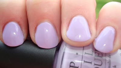
Rumple’s Wiggin is a pale purple crème and unlike the other big pale purple from this year, ChG Light as Air, this one does not lean pink. It reminds me of this color of lilacs. Finding the perfect pale purple has always been a quest for me, and I think Rumple’s Wiggin finally ends my quest. If you read my review of ChG’s Up and Away collection, you may recall that I mentioned Light as Air may be my Holy Grail pale purple. I still like Light as Air, but I think this color has taken its throne. As for formula and application, it was a little easier to apply than What’s With the Cattitude? but it was still rather thin. It took 3 coats to reach opacity, but it didn’t require babying like What’s With the Cattitude?

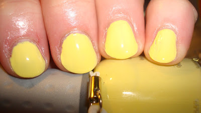
Fiercely Fiona is a pale yellow crème, but it’s not a pale lemon or a banana pudding yellow, like the other 2 pale yellows, ChG Lemon Fizz and Orly Lemonade, I reviewed this year. This one is a true yellow-green. Even with Who the Shrek are You? Being a bright, swampy green, I think this one is the most unusual of the collection. If I was asked to use one word to describe this color, I would say “tart”. I was all set to say this one applied the easiest of the 3 light shades in this collection and then it took 4 coats to reach complete opacity. The formula was good, though. It wasn’t at all watery, like What’s With the Cattitude?. Also, I thought this one would make my hands look dirty, but it didn’t. Bonus!

Ogre-the-Top Blue is a bright royal blue crème. In my pics, it leans a bit aqua, but it is a true-blue, IRL. It reminds me of ChG Sky-High Top from the Custom Kicks collection from summer 2009, though they aren’t dupes. Ogre-the-Top Blue is a bit lighter and brighter than Sky-High Top. Also, Sky-High Top has subtle shimmer, whereas Ogre-the-Top Blue is a true crème. If you compare it within the collection, you could say it’s the blue version of Funky Donkey… highly pigmented and very shiny. I love this color, and though it’s a hard call, I have to say this one is my favorite. Application was practically effortless. It was opaque in 2 coats.

Who the Shrek are You? is a bright lime green crème, and there is really no way to accurately describe this other than calling it a Shrek-green. It is truly the color of Shrek in nail polish form. It’s super shiny as well, like the other brights in this collection. Unlike the other brights, however, this one was a little more challenging to apply. It took 3 thin coats to reach opacity and was a tad streaky until the third coat. Also, I thought this one, like Fiercely Fiona would make my hands look dirty and red, but surprisingly, it did not.
The one thing I will say, is while I love OPI’s names, some of these were not meant to be taken literally. Just reading the names and knowing the characters on which they are based, you would expect What’s With the Cattitude? to be an bright yellow orange and Funky Donkey to be a medium grey.
OPI Shrek Forever After is OPI’s bright contribution for summer 2010. Compared to some movie/tv show tie-in collection in the past, this one is the best yet, though I do have undying love for the glitters in the Alice in Wonderland collection. There are 4 in this collection that I see myself wearing on a regular basis (both blues and purples), one that I would only wear if I were going to see Shrek Forever (Who the Shrek are You?), and one I couldn’t see myself wearing at all, but I can appreciate it for what it is (Fiercely Fiona). On the whole, the formula was a bit hit-or-miss. Both Funky Donkey and Ogre-the-Top Blue had effortless application and a perfect formula. The other 4 were a little harder to handle, with What’s With the Cattitude? being the most difficult. However, there’s not a single one that I would say to shy away from based on formula. Like I mentioned Fiercely Fiona and Who the Shrek are You? aren’t my style, but they are beautiful colors and, as far as I know, dupeless. All-in-all, I love this collection. I think OPI hit it out of the park with this one. It’s fun, bright, and perfect for summer. OPI Shrek Forever After is supposed to launch in May 2010, but I’ve read of a few people already finding it online and at beauty suppliers.
These were sent to me for review.
Before I start the review, let me just say that the entire time I was swatching the collection, I kept singing the Fairy Godmother’s rendition of “Holding Out for a Hero” from Shrek 2. Love that song. :)
On to the swatches...

Funky Donkey is a straight-up bright, medium purple crème and probably, aside from Rumple’s Wiggin, the most mainstream of the colors. It’s very reminiscent of last year’s RBL Mismas, or ChG Grape Pop from this year’s Up and Away Collection. I don’t own Mismas, but I will be sure to compare it to Grape Pop when I do my comp post later in the week. I know the nail polish world went from zero colors of this kind to three within 9-10 months, and if you ask me… that’s just fine. LOL. This one applied perfectly and was opaque in 2 coats.

What’s With the Cattitude? Is a pale blue crème, but beyond that, I was finding some difficulty describing it. Unlike the picture, it does not lean aqua. Bottle color is the most true-to-life. It’s not a baby blue. It’s not a robin’s egg blue, and it’s not a watery blue (though the formula is watery, but more on that in a bit). There’s a dustiness to it that I was having a hard time putting into words, other than to say it’s a dusty pale blue. Then I happened to find this on Crayola’s website, and when I put my nail up to my computer screen, What’s With the Cattitude? was the same shade as Crayola Blue Bell. I love this color. I can’t wait to use it as a full mani. As for the formula, well it was typical for being a pastel OPI. It was a little watery and as my nails are short, I had to use thin coats, as I had nowhere for excess polish to go. It was opaque in 3 coats, however, you may want to let these dry a little more than usual in-between coats as I did have a bit of drag. That said, while it’s more difficult to work with than the darker shades in this collection, it is a must for any blue lover. Plus, Puss in Boots is probably my favorite character from the Shrek series, so I love it even more for the name.

Rumple’s Wiggin is a pale purple crème and unlike the other big pale purple from this year, ChG Light as Air, this one does not lean pink. It reminds me of this color of lilacs. Finding the perfect pale purple has always been a quest for me, and I think Rumple’s Wiggin finally ends my quest. If you read my review of ChG’s Up and Away collection, you may recall that I mentioned Light as Air may be my Holy Grail pale purple. I still like Light as Air, but I think this color has taken its throne. As for formula and application, it was a little easier to apply than What’s With the Cattitude? but it was still rather thin. It took 3 coats to reach opacity, but it didn’t require babying like What’s With the Cattitude?

Fiercely Fiona is a pale yellow crème, but it’s not a pale lemon or a banana pudding yellow, like the other 2 pale yellows, ChG Lemon Fizz and Orly Lemonade, I reviewed this year. This one is a true yellow-green. Even with Who the Shrek are You? Being a bright, swampy green, I think this one is the most unusual of the collection. If I was asked to use one word to describe this color, I would say “tart”. I was all set to say this one applied the easiest of the 3 light shades in this collection and then it took 4 coats to reach complete opacity. The formula was good, though. It wasn’t at all watery, like What’s With the Cattitude?. Also, I thought this one would make my hands look dirty, but it didn’t. Bonus!

Ogre-the-Top Blue is a bright royal blue crème. In my pics, it leans a bit aqua, but it is a true-blue, IRL. It reminds me of ChG Sky-High Top from the Custom Kicks collection from summer 2009, though they aren’t dupes. Ogre-the-Top Blue is a bit lighter and brighter than Sky-High Top. Also, Sky-High Top has subtle shimmer, whereas Ogre-the-Top Blue is a true crème. If you compare it within the collection, you could say it’s the blue version of Funky Donkey… highly pigmented and very shiny. I love this color, and though it’s a hard call, I have to say this one is my favorite. Application was practically effortless. It was opaque in 2 coats.

Who the Shrek are You? is a bright lime green crème, and there is really no way to accurately describe this other than calling it a Shrek-green. It is truly the color of Shrek in nail polish form. It’s super shiny as well, like the other brights in this collection. Unlike the other brights, however, this one was a little more challenging to apply. It took 3 thin coats to reach opacity and was a tad streaky until the third coat. Also, I thought this one, like Fiercely Fiona would make my hands look dirty and red, but surprisingly, it did not.
The one thing I will say, is while I love OPI’s names, some of these were not meant to be taken literally. Just reading the names and knowing the characters on which they are based, you would expect What’s With the Cattitude? to be an bright yellow orange and Funky Donkey to be a medium grey.
OPI Shrek Forever After is OPI’s bright contribution for summer 2010. Compared to some movie/tv show tie-in collection in the past, this one is the best yet, though I do have undying love for the glitters in the Alice in Wonderland collection. There are 4 in this collection that I see myself wearing on a regular basis (both blues and purples), one that I would only wear if I were going to see Shrek Forever (Who the Shrek are You?), and one I couldn’t see myself wearing at all, but I can appreciate it for what it is (Fiercely Fiona). On the whole, the formula was a bit hit-or-miss. Both Funky Donkey and Ogre-the-Top Blue had effortless application and a perfect formula. The other 4 were a little harder to handle, with What’s With the Cattitude? being the most difficult. However, there’s not a single one that I would say to shy away from based on formula. Like I mentioned Fiercely Fiona and Who the Shrek are You? aren’t my style, but they are beautiful colors and, as far as I know, dupeless. All-in-all, I love this collection. I think OPI hit it out of the park with this one. It’s fun, bright, and perfect for summer. OPI Shrek Forever After is supposed to launch in May 2010, but I’ve read of a few people already finding it online and at beauty suppliers.
These were sent to me for review.
Tuesday, April 20, 2010
KOTD: Random Ribbons Funky French

Lately, I've been finding myself trying to push myself to be more and more creative with nail art. More times than not, it's just me thinking about designs before falling asleep, but sometimes it actually comes to fruition. This was one of those ideas that actually made it to my nails.
I started by using a base coat of Orly Love Each Other, a purple shimmer top coat, so the color of my natural nails could show through. I want to experiment more and more with konadding on bare (basecoated) nails. I then applied a konad design using plate m63. I used the ribbon stamp and three different colors, ChG Grape Pop (bright purple creme), ChG Light as Air (lavender creme), and ChG Devotion (a purple/silver metallic). I made sure the pattern was completely random by only using a part of it, or turning it in a different direction before stamping. I then topped with a coat of Out the Door.
I waited about 2 hours for my konad design and base coat to be completely set before I applied a funky french to my tips using one coat of ChG Grape Pop (I had to go back and touch up a few patchy spots, but the majority is one coat) . To get clean lines, I used Orly French Manicure Guides and waited 20 minutes or so until they were fully dry. Lastly, as I felt it needed a final element to look cohesive, I added a glitter line using Art Deco Striper in Silver Glitter under the French line. I then topped the entire nail with another coat of Out the Door to set it.
Okay, I realize it looks like I just threw everything but the kitchen sink on my nails, but I really love this. I love my natural nail color peeking though the konad. I love the subtle sparkle of the base coat, and I especially love my bright purple tips. There's something so unexpected about it that I absolutely adore and I can't wait to try this same "formula" using other colors and konad designs.
Also, I'm not going to lie to you all and tell you that it wasn't completely time-consuming. All-in-all, it took about an hour of stamping and painting to achieve this look, so it's not something that you'd want to do before you were rushing out the door, but I knew I'd have a bit of time while I was watching LOST and V to have my design set, and a little more time to complete the funky french before I went to sleep. Which is where I'm heading now. LOL.
Hope you all like this one and I'll see you in the morning. :)
Orly Red Sea Pearl
This has been a long time lemming of mine. Over the past 10 years or so, I probably had 4-5 bottles of this polish only to throw it away when it became glumpy, or whenever I stopped polishing my nails (which was a pretty often thing w/ me. I'd buy a bunch of polish and then give up on my nails within 6 mos). It always was one of my favorite colors, but was sadly d/c'd before I was able to pick it up (again).
Unlike most d/c'd OPIs, d/c'd Orlys are almost impossible to pick up on eBay and it was sold out at all the regular e-tailers. I'd pretty much given up on finding it until the other night I happened to do a google search on it and found the name in the text of an eBay listing. I emailed the seller and they still had them in stock, so I bought it and waited. It came yesterday.

Unlike most d/c'd OPIs, d/c'd Orlys are almost impossible to pick up on eBay and it was sold out at all the regular e-tailers. I'd pretty much given up on finding it until the other night I happened to do a google search on it and found the name in the text of an eBay listing. I emailed the seller and they still had them in stock, so I bought it and waited. It came yesterday.

*aaaaaahhhhhhhhhhhhh* Angels singing. This is truly one of my favorite polishes of all time. It's a bright fuschia shimmer with a pronounced blue flash. I know that's a popular type of polish, but this one is unique in that the base color is a darker pink, rather than a hot pink. This was 3 coats, as I still had VNLs after 2 coats. This is old-formula Orly, so it stunk to high, chemically heaven, but there were no issues with application.
I almost didn't want to post this one, as it's very hard to find (but not super spendy like an OPI HTF is, eBay scalpers tend not to hoard Orly polishes), and I didn't want to create any lemmings, but I just had to show it off. If you like the color, you may want to try OPI Pompeii Purple, which it my knowledge is still available, and unlike the name suggests, is a hot pink shimmer with a blue flash. It's very similar, though a bit pinker and brighter. I tried to do a comp post, but I couldn't get my camera to pick up the differences. Maybe I'll try one in the sun a little later in the week.
I wish I could convince Orly to bring this one back and name it "Megan's Favorite". LOL. I love it that much. :)
Monday, April 19, 2010
Color Club Pardon My French Collection Part 2
Yesterday, I posted part 1 of this collection (the cremes), so for today, here are the glitters. As these are all very similar in formula and application, so rather than doing a full review of each color under the picture, I'm going to post individual pics and review them altogether.


Hot Couture - pale pink glitter
All three of these are 2 coats and there were no application issues. These were very much like CC's Japanese glitters, and aside from Turn the Other Chic (ew), I liked them. Like the Japanese glitters, these have holo glitters. TtOC made my nails look stained. It it was more of a sherbet orange than an yellow/apricot orange, I think it would have been a beautiful polish. The other 2 are very pretty and I think would look amazing over a French manicure, something I plan to do in the near future.
Again, like I mentioned yesterday, I hope this helps some of you. I'd seen this collection for sale at various etailer sites, but I knew nothing about it. Unlike Rebel Debutante, which was released around the same time, this one got very little press and blogger reviews. I know Siobhan at the Nailphile did a review of these, but that's the only one I remember seeing. Though, there may be a few more since I last googled this collection.
If you happen to find this collection at Ross, like I did, I think it may be worthwhile picking up. Sure, it's not a spectacular collection, but I feel Meet Me at Your Chateau alone is worth the price of admission, and the pink cremes and the two, non orange glitters are pretty and are okay addittions to my collections. However, the two oranges are just a waste, IMO. I realize that CC tends to do 6-7 polish collections, but I really don't see how those 2 polishes would work for the vast majority of people. Perhaps, 2 purples (and creme and a glitter) would have been a better addition to the collection.

Turn the Other Chic- pale orange glitter

Si Vous Please! - icy white/pale blue glitter

Hot Couture - pale pink glitter
All three of these are 2 coats and there were no application issues. These were very much like CC's Japanese glitters, and aside from Turn the Other Chic (ew), I liked them. Like the Japanese glitters, these have holo glitters. TtOC made my nails look stained. It it was more of a sherbet orange than an yellow/apricot orange, I think it would have been a beautiful polish. The other 2 are very pretty and I think would look amazing over a French manicure, something I plan to do in the near future.
Again, like I mentioned yesterday, I hope this helps some of you. I'd seen this collection for sale at various etailer sites, but I knew nothing about it. Unlike Rebel Debutante, which was released around the same time, this one got very little press and blogger reviews. I know Siobhan at the Nailphile did a review of these, but that's the only one I remember seeing. Though, there may be a few more since I last googled this collection.
If you happen to find this collection at Ross, like I did, I think it may be worthwhile picking up. Sure, it's not a spectacular collection, but I feel Meet Me at Your Chateau alone is worth the price of admission, and the pink cremes and the two, non orange glitters are pretty and are okay addittions to my collections. However, the two oranges are just a waste, IMO. I realize that CC tends to do 6-7 polish collections, but I really don't see how those 2 polishes would work for the vast majority of people. Perhaps, 2 purples (and creme and a glitter) would have been a better addition to the collection.
Sunday, April 18, 2010
Color Club Pardon My French Collection Part 1
I picked up this collection at Ross about 6 weeks ago. I had the text of a post all typed out and then I went back to review my pictures and they were all so bad, I couldn't post them. I figured if I wanted to do this collection any sort of justice, I'll have to wait until my nubbins grew out a little more and until I had a bit more time in which to swatch, take pics, review, and post.
This is a confusing collection, in that the name is misleading. Given the name "Pardon my French", you may assume it was a collection of polishes to be used for French manicures. Um... not so much. LOL. It's a collection of 2 opaques (well one opaque and one almost-opaque, 2 semi-sheers, and 3 glitters). Truth be told, I didn't really like the look of this collection when I got, but 1. I wanted Take Me to Your Chateau, so I figured for a few bucks more, I could review the entire collection and 2. I think part of me just bought it because I actually found a CC collection at Ross... something that'd been eluding me for months. Unfortunately, my opinion hasn't changed all that much, save for 2-3 polishes. I haven't seen much press on this collection, aside from a couple blog reviews, so I hope this will help someone that sees it on an etailer's website and wonders what it's all about (just like I did).
Today, I'm going to show you the cremes and tomorrow will be the glitters. I suppose this collection was meant for layering, but I don't really like layering with CC's holo glitters (for some odd reason), so unless someone posts a request for me to layer 2 particular polishes, I'm going to not layer these.
Okay... without much further adieu (ha.French.ha), here are the cremes....


I saved the best creme, and in IMO, the best in the collection, for last...

This is a confusing collection, in that the name is misleading. Given the name "Pardon my French", you may assume it was a collection of polishes to be used for French manicures. Um... not so much. LOL. It's a collection of 2 opaques (well one opaque and one almost-opaque, 2 semi-sheers, and 3 glitters). Truth be told, I didn't really like the look of this collection when I got, but 1. I wanted Take Me to Your Chateau, so I figured for a few bucks more, I could review the entire collection and 2. I think part of me just bought it because I actually found a CC collection at Ross... something that'd been eluding me for months. Unfortunately, my opinion hasn't changed all that much, save for 2-3 polishes. I haven't seen much press on this collection, aside from a couple blog reviews, so I hope this will help someone that sees it on an etailer's website and wonders what it's all about (just like I did).
Today, I'm going to show you the cremes and tomorrow will be the glitters. I suppose this collection was meant for layering, but I don't really like layering with CC's holo glitters (for some odd reason), so unless someone posts a request for me to layer 2 particular polishes, I'm going to not layer these.
Okay... without much further adieu (ha.French.ha), here are the cremes....

Oh Naturale. Let me go on and start with my least favorite first. Oh Naturale is a pale, sheer, orange-y peach. It almost looks like a dreamsicle orange, but there is a bit too much yellow in it to be that shade. It almost reminds me of the color of apricots. I really don't like this color. I think on my skintone, it's extremely unflattering. Perhaps if you have a tan or a darker, less pink, skintone, you may be able to make it work. However, it's very streaky. This is 2 coats and you can still see big streaks. Hovever, I wanted to try and do this color some justice and see if additional coats would help. Below is 5 COATS and it's still not fully opaque and even in application.

Sorry girls, I think this one is a pass.

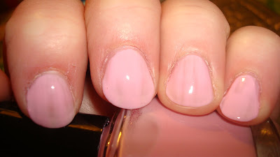
Pardon My French. This one is a pale milky pink and is pretty in theory. I have no problem with sheers, but it was way streaky, just like Oh Naturale. I was able to combat the streaky-ness some what by using thin coats, but they were still there. However, I do like the color, so if you use a base coat and are careful to let coats dry in-between, you may be able to get this one to work for you in 2-3 coats. Pic is 2 thin coats.

I Believe in Amour. This one is a pale, dusty rose, with a milky quality, like Pardon My French. It's a beautiful color, but it was still streaky and not opaque at 2 coats. Although, I love this one so much, I tried it with a base coat and gave it 3 coats and a bit more time and I think it's very doable (pic below). I plan on using this one as a full mani in the future.

I saved the best creme, and in IMO, the best in the collection, for last...

Take Me to Your Chateau. This is an amazing pale blue. It's opaque in 2 coats and very pigmented for a pastel. In the pic, it looks like it may lean a bit turquoise, or green, but that's not the case. It's a straight-up pale blue This was 2 coats, though it was almost opaque in one. If you been looking for a perfect pale blue, definitely pick this one up. I plan on having a pale blue comp post w/in the next few days.
All in all, I found myself torn on these polishes. I love, love, love Take Me to Your Chateau. I also like the colors of I Believe in Amour and Pardon My French, but the formula requires patience and time and it's not effortless like TMtYC. As for Oh Naturale... for me, it's a pass. I really don't see how it could work for anyone given the streaky-ness, but if you love the color, you may be able to make it work with a good sticky base coat and time between (thin) coats. Also, aside from TMtYC, these required thin coats. If I put too much on my brush, it was very globby and hard to keep it from pooling on the nail.
Tomorrow, I will post the glitters in this collection, so stay tuned. :)
Saturday, April 17, 2010
Pale Yellow Comps
In a post a few days ago, I mentioned that Orly Lemonade is very similar to ChG Lemon Fizz. Here's proof...

Lemonade on middle and pinky, Lemon Fizz on ring, and, for good measure, Happy Go Lucky is on my index finger.
All 3 of these are 3-coaters and were streaky until you hit that magical third coat. Also, they were all 3 a little hard to handle. Thin coats is the way to go on these.
Both Lemonade and Lemon Fizz are pale lemon yellows, though IRL, Lemon Fizz is a very slight bit warmer, but it's so slight, no one would notice, or even care for that matter. Happy Go Lucky, OTOH, is a brighter, sunnier yellow. It's almost the color of the forsythias that are popping up everywhere right about now. Of the 3, I would have to say that HGL is my favorite, but it's by a slight margin. I love all three of them and can't wait to wear them more and more as we get closer to summer.
Friday, April 16, 2010
Sally Hansen Insta-Dri Grape Going!
On Sunday, after a night of swatching, writing, and scheduling posts (which is my new way to not be a slack-ass blogger), I decided I'd pick my color for the next day or 2, do a mani, take a pic, and be on my way. Unfortunately, I picked a big fat disappointment.
Probably like the majority of people that picked up this polish, I did so because it was supposedly dupish to RBL Scrangie. Truth be told, Scrangie (the polish) had never really grabbed me. It looked pretty enough, but perhaps I'm broken, because swatches of it never gave me a polish-gasm, unlike most normal polish junkies (ha... normal polish junkies, that's an oxymoron). However, I did almost pick it up during RBL's fall sale just because it was LE and Scrangie (the blogger) is one of my favorites. I decided not to, though, because I thought it would be best if I let someone that really wanted it get it, as I had a feeling it would sell out. Then, I read that SH I-D Grape Going, was a close fascimile to RBL Scrangie, so I decided to pick it up. It's pretty enough in the bottle... a shimmery blue-purple, but it didn't have the green flash of Scrangie, but I fgured for $5, that was okay. Afterall, the RBL was 18 bucks.
I picked this up several months ago, when the new Insta-Dris came out, but I just now got around to trying it. OMG. I couldn't get it off my nails fast enough. Before I go too far, here's a pic:

All I can say is "ew". Now, don't get me wrong, I don't think RBL Scrangie is in anyway "ew"-worthy. Granted, I don't own it, but in pics, it looks pretty, it just didn't make me want to pay $18 for it (if that makes sense). However, the flash in this from blue to purple was minimal, and it has a frosty sheen that just made my hands look gross.
Also the formula and application were shit. Pardon my language, but there is no other way to describe it. I've never tried an I-D (just the TC which isn't the same), and I'd heard the brush was troublesome, but I didn't know it was such a PITA. It's like a big mop that slops polish all over your cuticles. I can't imagine how girls with small nail beds deal with it. Also, the formula is hard to deal with. Given the name, Insta-Dri, it's only reasonable to assume that it would dry fast, but this was more irritating than a matte. You have to work very fast, and if you need a second coat, you have to make sure that mop of a brush is fully saturated or you have pulling, and of course, that puts too much polish on your nail, so you are just chasing it around with that irksome brush. Grrr.
All in all, IMO, avoid this polish at all costs. If you wanted Scrangie, but didn't nab it before RBL sold out, fear not because Ji is bringing it back (along with No More War (yay!!!) and Opaque Nude). I realize RBLs aren't in everyone's price range (and they aren't really in mine, if I'm being honest), but for such a specific color, I think it's worth it, especially if you've been lemming Scrangie. And though it doesn't really wow me in pics, I think I'm going to pick it up myself\. I kinda want to see what it's all about. Certainly everyone that raves about it can't be wrong.
Thursday, April 15, 2010
Glitter French
On the whole, I dislike the look of traditional French manicures. However, when you take a traditional French and add in a konad design or some glitter along the white line, then I love them. There's something about taking the boring and adding a small detail to make it un-boring that makes me love it.
I've recently become a wee bit obsessed with Frenches. In fact, when I recently ordered basecoats from TD, I made sure to add in several French Manicue polishes from Orly's French line, as I didn't have any clear tinted polishes, or even a good tip white, for that matter.
Unfortunately, Frenches are a little time consuming and time is something I am sorely lacking, so I am not able to do them very often. In fact, I rushed this one and thus, it didn't look the best, so I took pictures and then promptly took it off (there was a lot of bubbling on my thumb). Next time I try, I'm going to do so when the twins are asleep and when I have more than 20 minutes to devote to my nails.
Anyway, I started with Orly's French manicure guides. Sure, you can free hand it, and I often do, but it's much easier to use the guides. You simply put them a little below the white part on you names. One trick is to take them off quickly, like a Band-aid, especially if they aren't fully dry when you remove the guides.

Then I applied 2 coats of Orly Beverly Hills Manicure in Beverly Hills Plum. BH Plum, is actually a sheer rose, but it has a bit more pigment in it than Orly French Manicure Bare Rose.

Lastly is one coat of quick dry TC and then a bit of silver glitter along the white like with Art Deco striper in Silver Glitter.

I had plans of applying a silver konadded butterfly in the "natural" portion of my nails. Unfortunately, that didn't come to fruition. I just couldn't stand the bubbles on my thumb and I didn't have lots more time to wait for it to set. Plus, I'd only done one hand. LOL.
I know it's really conventional, and perhaps doesn't appeal to the vast majority of nail blog readers, but I really love this look. I plan on doing them more in the future, but adding glitter and/or konadding over top. Now, I need to go apply a bright green, to get over my "normal" problem. :P
I've recently become a wee bit obsessed with Frenches. In fact, when I recently ordered basecoats from TD, I made sure to add in several French Manicue polishes from Orly's French line, as I didn't have any clear tinted polishes, or even a good tip white, for that matter.
Unfortunately, Frenches are a little time consuming and time is something I am sorely lacking, so I am not able to do them very often. In fact, I rushed this one and thus, it didn't look the best, so I took pictures and then promptly took it off (there was a lot of bubbling on my thumb). Next time I try, I'm going to do so when the twins are asleep and when I have more than 20 minutes to devote to my nails.
Anyway, I started with Orly's French manicure guides. Sure, you can free hand it, and I often do, but it's much easier to use the guides. You simply put them a little below the white part on you names. One trick is to take them off quickly, like a Band-aid, especially if they aren't fully dry when you remove the guides.
Next, I applied 2 coats of Orly Pointe Blanche, a heavily pigmented, thick (yet not chalky) white to the area on my nail, above the guide.


Lastly is one coat of quick dry TC and then a bit of silver glitter along the white like with Art Deco striper in Silver Glitter.

I had plans of applying a silver konadded butterfly in the "natural" portion of my nails. Unfortunately, that didn't come to fruition. I just couldn't stand the bubbles on my thumb and I didn't have lots more time to wait for it to set. Plus, I'd only done one hand. LOL.
I know it's really conventional, and perhaps doesn't appeal to the vast majority of nail blog readers, but I really love this look. I plan on doing them more in the future, but adding glitter and/or konadding over top. Now, I need to go apply a bright green, to get over my "normal" problem. :P
Wednesday, April 14, 2010
Misa Dirty Sexy Money comps
In an effort to help some of you squash the lemming that is Misa DSM, I did a couple of comparision swatches. Unfortunately, IMO, lemmings will failed to be killed with these pictures, but they are good for comparision's sake nonetheless.
First up... DSM and Orly Gumdrop.

Gumdrop on index and ring, DSM on middle and pinky
In the bottle Gumdrop looks very similar to DSM, albeit a little lighter. However, that does not translate to the nail. While Gumdrop has the same dustyness as DSM, the colors are nowhere near close.
So then I decided to try DSM with OPI Jade is the New Black.

JitNB on index and ring, DSM on middle and pinky
Unlike with Gumdrop, the colors themselves are closer, however, JitNB is deeper and more vibrant and doesn't have the dusty/dirty-ness of DSM.
If you are dying for DSM, and don't want to pay $13 for it on eBay, you can consider getting JitNB or Gumdrop, but I don't think it's going to fix the lemming. Sadly, DSM is d/c'd and sold out most everywhere, though a quick search found it on eBay (as previously mentioned) and at Misa's website, though you have to create an account to see the price (though IIRC, it's $7).
Hopefully, this has helped someone a wee bit, though I doubt it. LOL
Tuesday, April 13, 2010
Orly Sweet Collection (well 2/3rds)
I posted the press release for this collection back in December. Many bloggers received samples of this shortly thereafter, so I figured I was out of luck, until Orly's PR firm asked me a few weeks ago if I'd be interested in trying some from the collection. As luck would have it, I'd already picked up Gumdrop and Snowcone, and I even posted about Snowcone last month.
Orly sent me another Snowcone as well as Lemonade and Cotton Candy. As I already had Gumdrop, I figured I'd include it as well. As I do not have the other 2, Lollipop and Pixie Stick, so this is 2/3rds of the Sweet Collection. :P
Here are the pics...
Lemonade - pale yellow. This is pretty close to ChG's new pale yellow, Lemon Fizz. the formulas are very similar as well. I compared both of them for an upcoming comp post and they were both streaky until 3 coats. It was also a little hard to control, but as was the ChG. If you want a pale lemon yellow, this one (or Lemon Fizz) would fit the bill.

Cotton Candy - pale peachy pink. This is a beautiful color in the bottle, and it's one that doesn't have any dupes in the Up and Away collection. Unfortunately, this didn't work with my skin. Most pinks look good on me, but if they have too much peach/orange in them, all they do is make my hands look dirty. This one was also problematic with formula and application. It too 3 coats to reach opacity and it was streaky and hard to handle.

Gumdrop - dusty pale turquoise. Another one with no dupes in U&A. Though, in the bottle it is very similar to Misa DSM, and IMO, more appropriate for spring than DSM. This one and Snowcone will have to duke it out for best of this collection. It's a gorgeous pale green-blue turquoise. It reminds me of seafoam green, but it's no where near mint green. Unlike the previous 2, this one had awesome formula and application. It was opaque in 2 coats and practically flowed on my nails. Someome remind me to do a comp with this one and DSM. I know many people are jonesing for DSM and this one may kill a lemming for some of you.

Snowcone - pale blue. Almost like a pale cornflower blue. This pic, like in my previous post is a little too vibrant to be true-to-life. The color on my index and pinky are the most accurate. Again, no dupes in U&A. Like Gumdrop, the formula and application were perfect... 2 coats and no issues.
I'm torn on this collection, well the 4 that I reviewed. Lemonade and Cotton Candy, while pretty, were frustrating. However, Gumdrop and Snowcone are both beautiful and effortless. If you like blues and greens, do not hesitate to pick up Gumdrop and Snowcone. If you are pale and pink like me, Cotton Candy should be a pass, and if you are looking for a pale yellow, check out ChG Lemon Fizz before Lemonade, though if you would rather get Lemonade, keep in mind that it's a lovely pale yellow, just hard to control.
Snowcone, Cotton Candy, and Lemonade were sent to me for review
Orly sent me another Snowcone as well as Lemonade and Cotton Candy. As I already had Gumdrop, I figured I'd include it as well. As I do not have the other 2, Lollipop and Pixie Stick, so this is 2/3rds of the Sweet Collection. :P
Here are the pics...

Lemonade - pale yellow. This is pretty close to ChG's new pale yellow, Lemon Fizz. the formulas are very similar as well. I compared both of them for an upcoming comp post and they were both streaky until 3 coats. It was also a little hard to control, but as was the ChG. If you want a pale lemon yellow, this one (or Lemon Fizz) would fit the bill.

Cotton Candy - pale peachy pink. This is a beautiful color in the bottle, and it's one that doesn't have any dupes in the Up and Away collection. Unfortunately, this didn't work with my skin. Most pinks look good on me, but if they have too much peach/orange in them, all they do is make my hands look dirty. This one was also problematic with formula and application. It too 3 coats to reach opacity and it was streaky and hard to handle.

Gumdrop - dusty pale turquoise. Another one with no dupes in U&A. Though, in the bottle it is very similar to Misa DSM, and IMO, more appropriate for spring than DSM. This one and Snowcone will have to duke it out for best of this collection. It's a gorgeous pale green-blue turquoise. It reminds me of seafoam green, but it's no where near mint green. Unlike the previous 2, this one had awesome formula and application. It was opaque in 2 coats and practically flowed on my nails. Someome remind me to do a comp with this one and DSM. I know many people are jonesing for DSM and this one may kill a lemming for some of you.

Snowcone - pale blue. Almost like a pale cornflower blue. This pic, like in my previous post is a little too vibrant to be true-to-life. The color on my index and pinky are the most accurate. Again, no dupes in U&A. Like Gumdrop, the formula and application were perfect... 2 coats and no issues.
I'm torn on this collection, well the 4 that I reviewed. Lemonade and Cotton Candy, while pretty, were frustrating. However, Gumdrop and Snowcone are both beautiful and effortless. If you like blues and greens, do not hesitate to pick up Gumdrop and Snowcone. If you are pale and pink like me, Cotton Candy should be a pass, and if you are looking for a pale yellow, check out ChG Lemon Fizz before Lemonade, though if you would rather get Lemonade, keep in mind that it's a lovely pale yellow, just hard to control.
Snowcone, Cotton Candy, and Lemonade were sent to me for review
RBL Purple Haze Comps
As I mentioned in my NOTD post from yesterday, I was interested in comparing RBL Purple Haze to OPI Parlez-Vous OPI. Here are the results. I also threw in OPI Done out in Deco for good measure.

Done out in Deco on index, RBL on middle and pinky, and Parlez-Vous OPI on ring. BTW, I apologize for the skin around my index finger. I can't keep my index fingers or my thumbs from peeling and it's driving me bonkers.
As you can tell, neither DoiD or PVO are dupes for PH. Even though PH has a hazy-ness to it, PVO is just too smoky to be dupey for RBL. It's also no where near the same color of purple. PVO has more red in it. As for DoiD, the colors aren't close, but they look like they could be related. It looks like if you added a bunch of white to PH, you'd have DoiD. It is dusty/hazy, but not to the same degree as PH.
All in all, I think if you are lemming Purple Haze, you aren't going to find a dupe in either of these. I know Ji said it will be OOS soon, but I don't know it it will be d/c'd or just backordered for awhile.
Orly Iron Butterfly

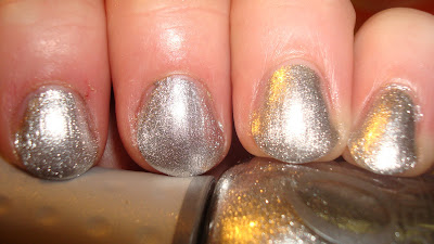
When Orly introduced their Metal Chic collection, there was one color that I wanted and that was Iron Butterfly. So, when they offered to send me one from the collection to try and review, I was so happy that they sent me Iron Butterfly. I may have even giggled when I opened the package. Though, I am a little over the whole matte thing, I do like this polish, and I may even like it more w/ a top coat (see below).
It's a deep charcoal grey matte with silver shimmer. Because it's matte, the shimmer looks like a rubbed silver, more than a bright shiny silver. This was 2 coats, and I had no problems with application. The formulation was more like OPI's Suede collection rather than a traditional matte.
It's awesome with a top coat, too.

If you are interested in viewing the entire collection, Scrangie has a drool-inducing post featuring Iron Butterfly as well as the other 2 in the collection. Her posts makes me want to pick up the other 2 polishes, even though they would look like crap with my skin (of course, all of Scrangie's posts do that. LOL).
This was sent to me for review
Monday, April 12, 2010
NOTD: RBL Purple Haze

I chose this one as my NOTD because I remembered a recent FB post in which Ji mentioned Purple Haze was on it's way to selling out. I bought it back in the fall as part of my 50% off order, but I had yet to try it. I was a little wary to try it, given my past issues with RBL's formula, but I used one coat of Amour Sticky Base Coat and one coat of SH Insta-Dri TC and it dried within 30 minutes w/ no issues. This is 2 coats and there were no issues with application. The formula was perfect.
As for the color, this one was a bit of a surprise. I added this one on a whim to my order last fall. I thought the color was going to be a softer version of vibrant purple creme, like RBL Mismas or ChG Grape Pop. While it's true that it's a medium purple creme, there is also a smokyness to it that I didn't expect. It really does have a hazy quality to it... hence the name. LOL. She's a clever one, that Ji Baek. It reminds me of OPI Parlez-Vous OPI, though I think PH is a bit more vibrant. I plan on doing a comp post with P-VO and PH in the near future.
If you are interested, Purple Haze is still available at rescuebeauty.com. It's $18 and $7.50 which I know is nuts, but it's an amazing color with an amazing formula, but I'm going to hold off a "you have to get it" rec until I comp it w/ PVO. BTW, Ji is now offering free shipping on $100 orders in the US and on $200 for international orders.
Random NOTD

This was my St. Patrick's Day mani that I never got around to posting. I've been dealing with a lot of stuff surrounding my son, so I rarely have time to paint my nails and post anymore (though I've figured out a new strategy to always have new posts). I only mention that because I wore this to my son's ped's office on St. Patrick's day and his nurse commented that she liked my nails. :)
This is ChG Four Leaf Clover (keep in mind, it's a kelly green) and a fauxnad stamp in ChG Emerald Sparkle and 2 ChG from the "warm" Romantiques collection, but I can't tell you which ones. Poetic and Passion, maybe?
I thought it was so fun, I couldn't not post it, even it is a month late. LOL.
Sunday, April 11, 2010
Orly Foil FX Collection Redux
Earlier this year, I posted about Orly's new Foil FX Collection. Orly's PR firm had sent me Luxe to swatch and review. I fell in love with the collection, and the look of Luxe, so I decided to pick up the 2 remaining colors, Rage and Shine as soon as they were available at e-tailers.
Here are the swatches...

Rage - Rose Gold. My favorite of the bunch. I knew I would love this one as soon as I saw it on Vampy Varnish. It works with my skin tone and is the least "blingy" of the 3 colors, though that's not to say it's not completely shiny.
Shine - Silver. My second favorite. This is a gorgeous true silver.
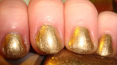
Luxe - Gold. My least favorite. I like it, but it just doesn't work with my skintone. It's a very bright warm gold.
All 3 are 2 coats and I had no application issues with any of them.
Orly had stated in their press release that this collection was to mimic the look of Minx. They are beautiful foils, but while they can pass for Minx in a pinch, they don't really capture the look of being coated in gold/silver foil of Minx.
If you love foils, I would seriously consider picking these up. They are ~$3 at e-tailers. Sally's may have these, but I haven't been there in so long, I can't say for certain.
Luxe was sent to me for review
Here are the swatches...

Rage - Rose Gold. My favorite of the bunch. I knew I would love this one as soon as I saw it on Vampy Varnish. It works with my skin tone and is the least "blingy" of the 3 colors, though that's not to say it's not completely shiny.

Shine - Silver. My second favorite. This is a gorgeous true silver.

Luxe - Gold. My least favorite. I like it, but it just doesn't work with my skintone. It's a very bright warm gold.
All 3 are 2 coats and I had no application issues with any of them.
Orly had stated in their press release that this collection was to mimic the look of Minx. They are beautiful foils, but while they can pass for Minx in a pinch, they don't really capture the look of being coated in gold/silver foil of Minx.
If you love foils, I would seriously consider picking these up. They are ~$3 at e-tailers. Sally's may have these, but I haven't been there in so long, I can't say for certain.
Luxe was sent to me for review
Subscribe to:
Posts (Atom)